
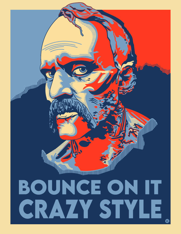
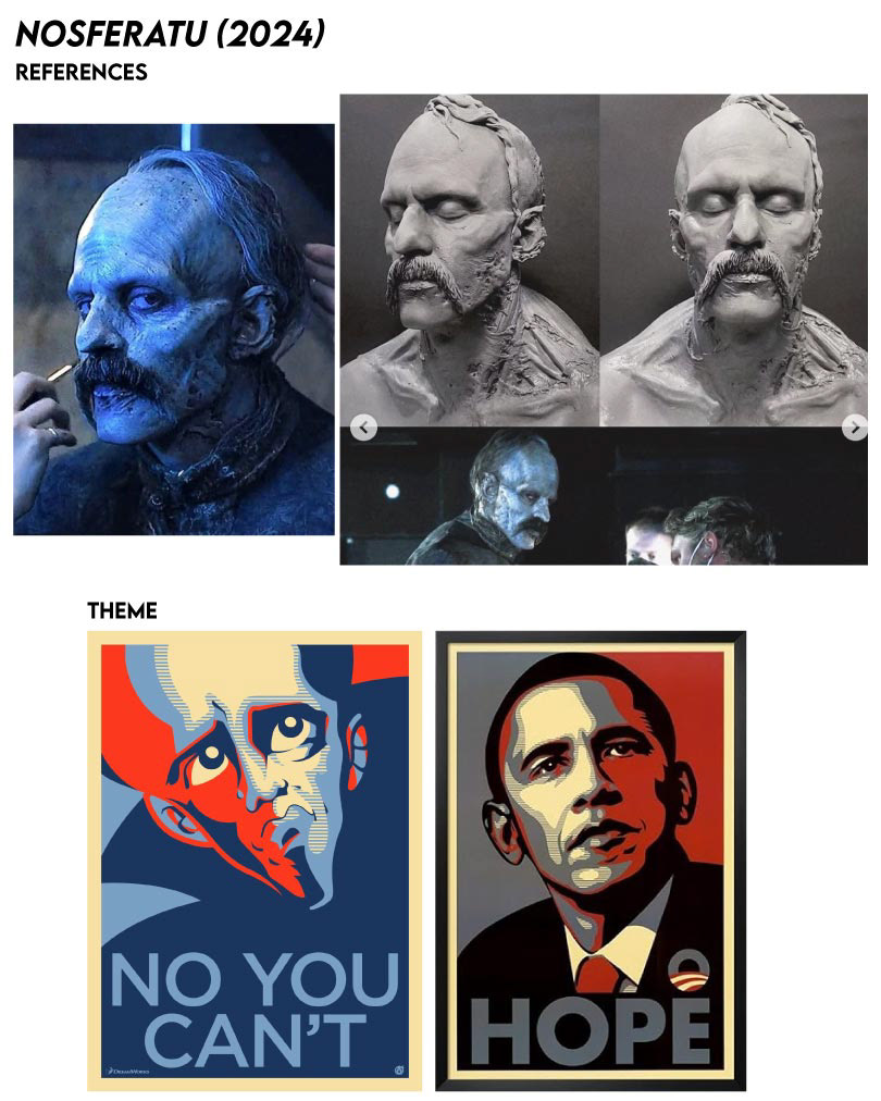
Nosferatu, "Bounce On It, Crazy Style"
"Political Poster". Full View, Large Poster 13" x 19". Fan Art, Completed: March 7th, 2025

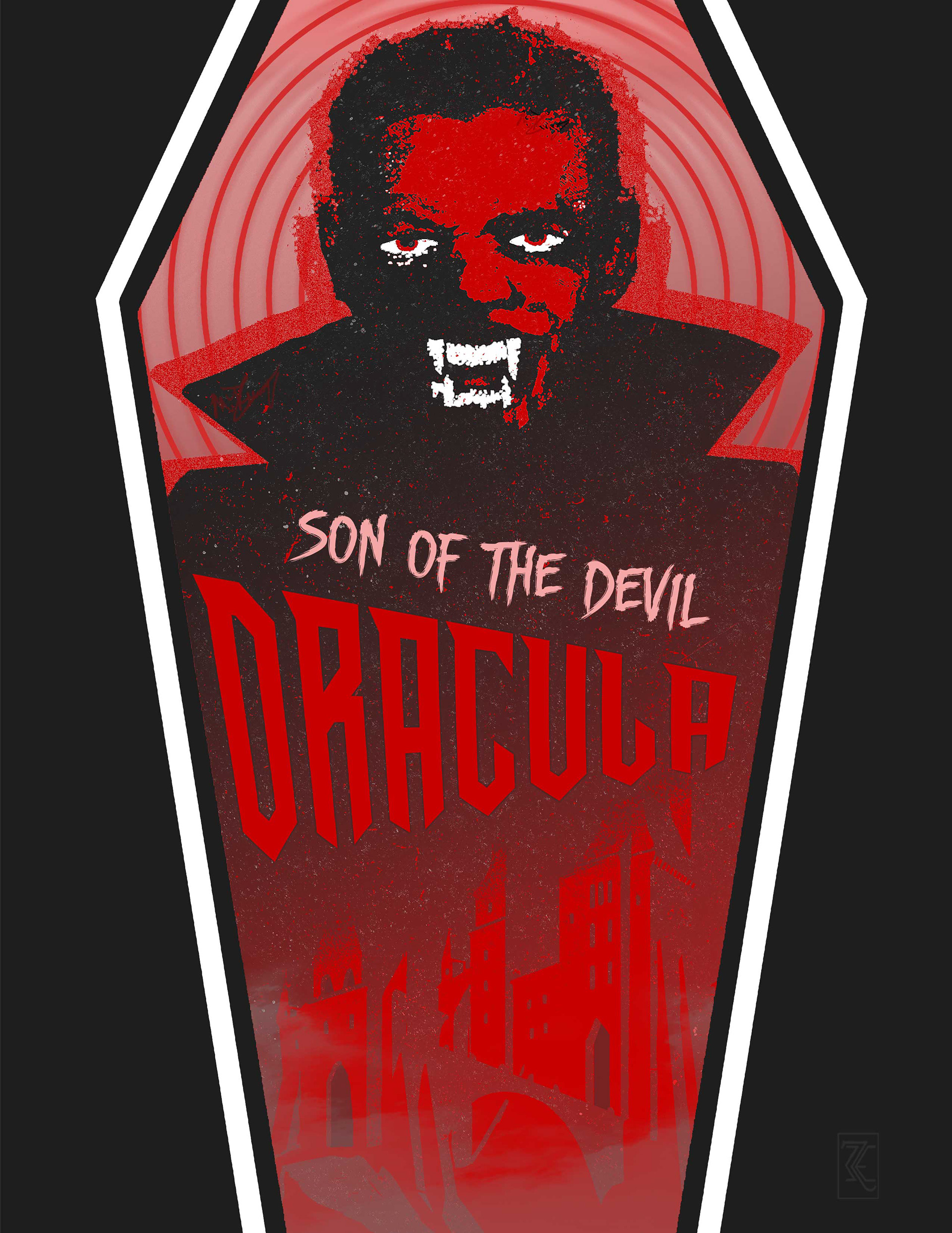
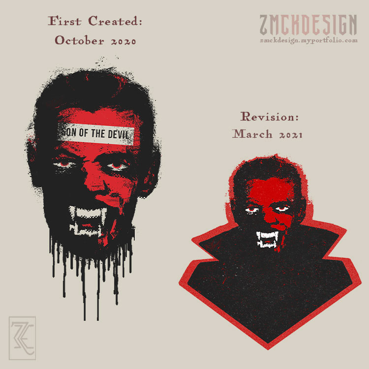
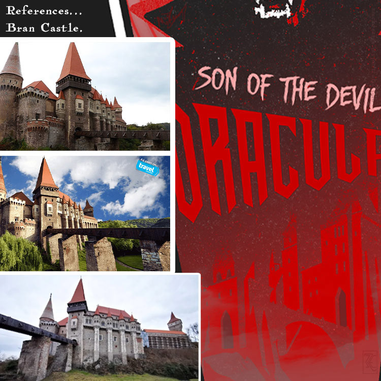
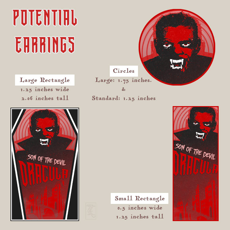
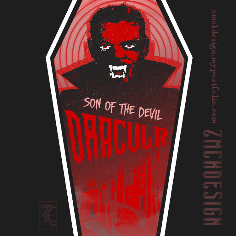
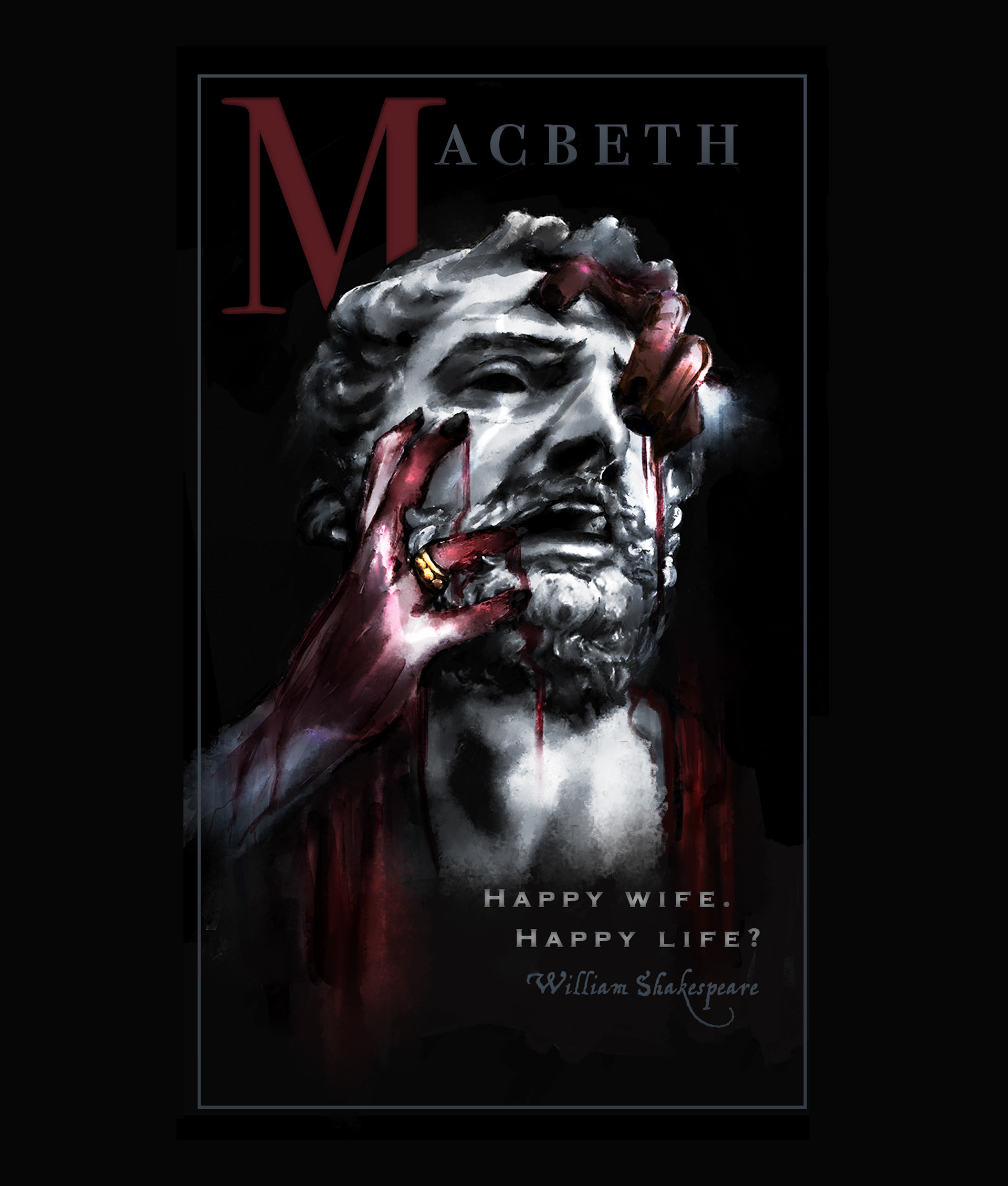
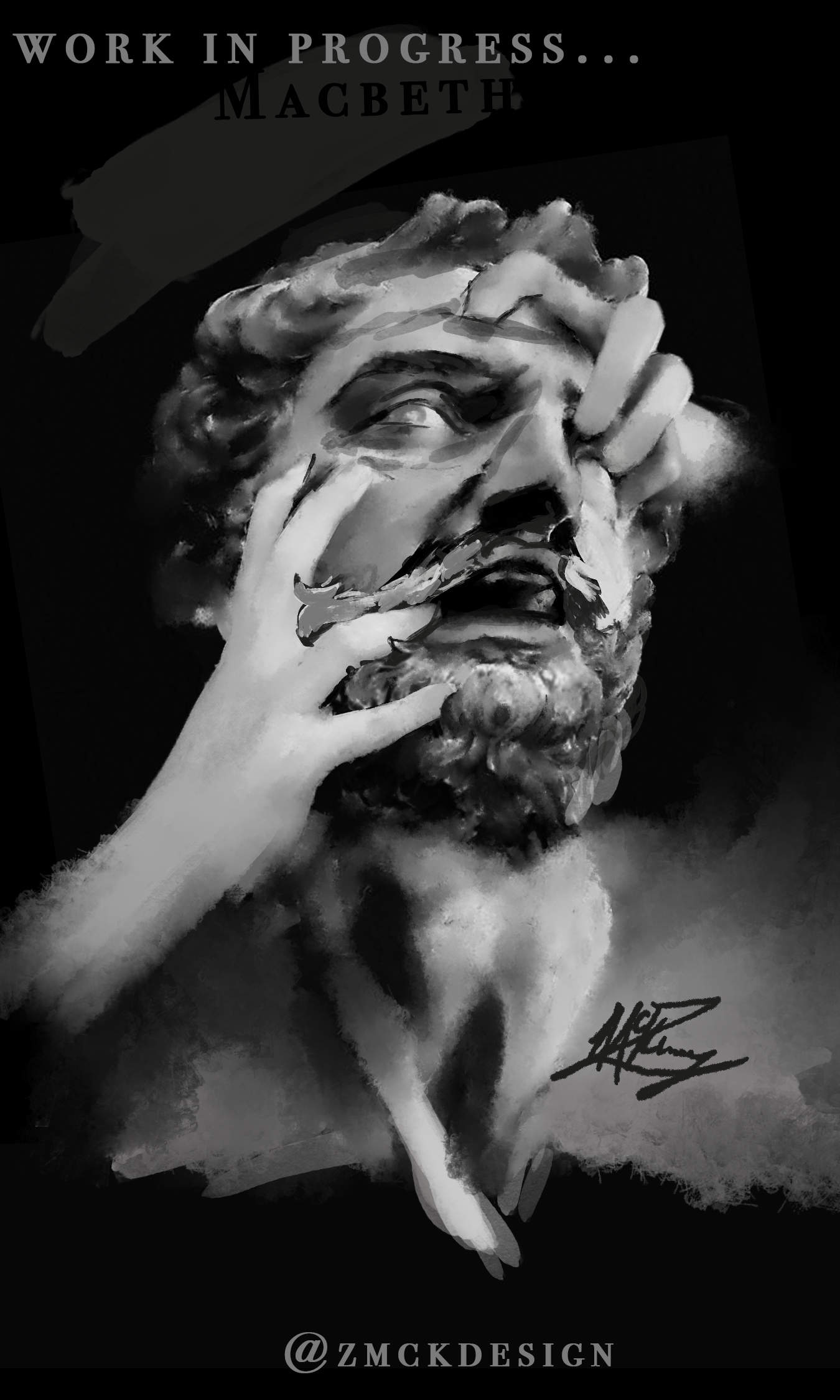
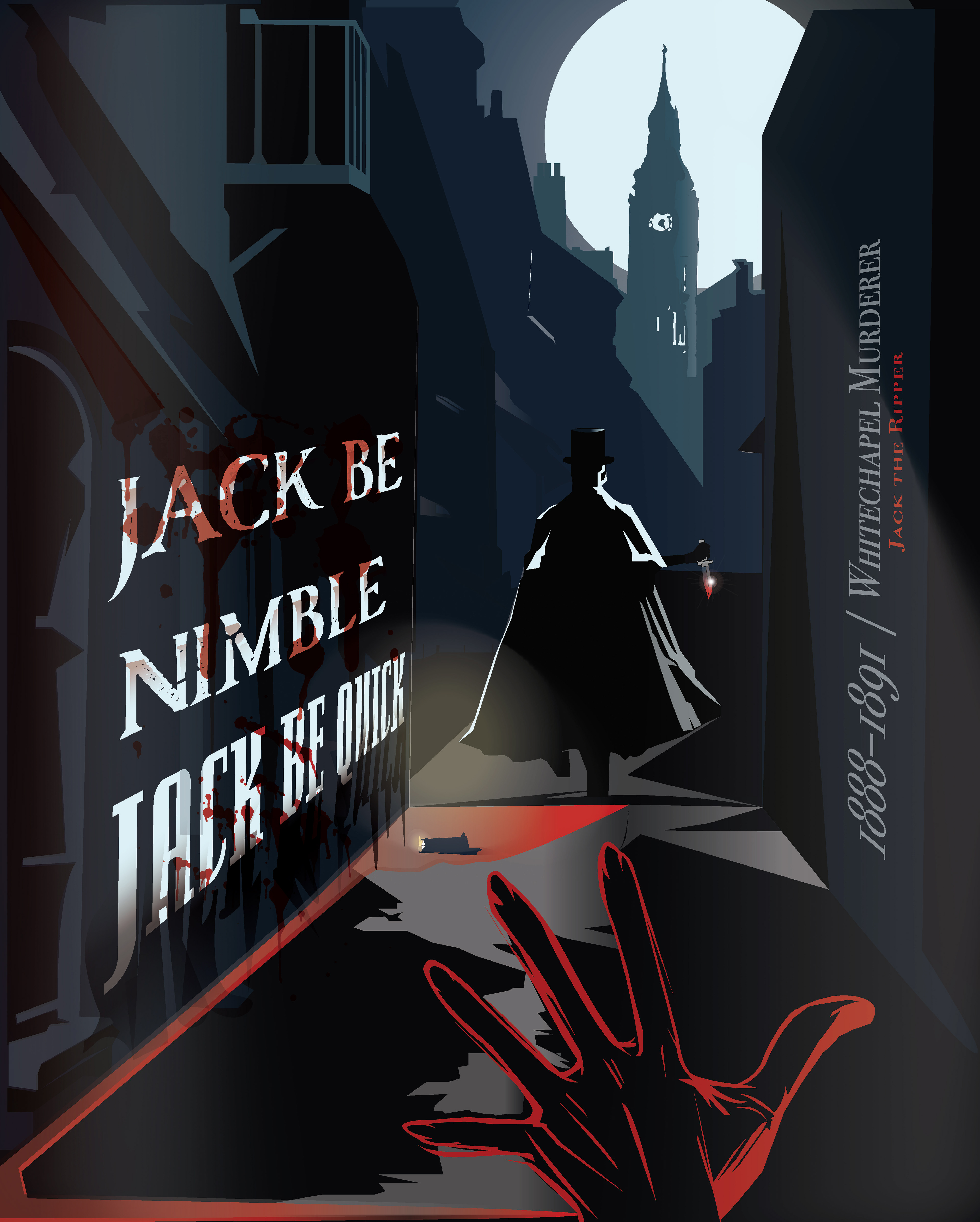
Dracula, Son of the Devil
October 21st, 2024.
Dracula with Castle Vintage Movie Poster Concept Design.

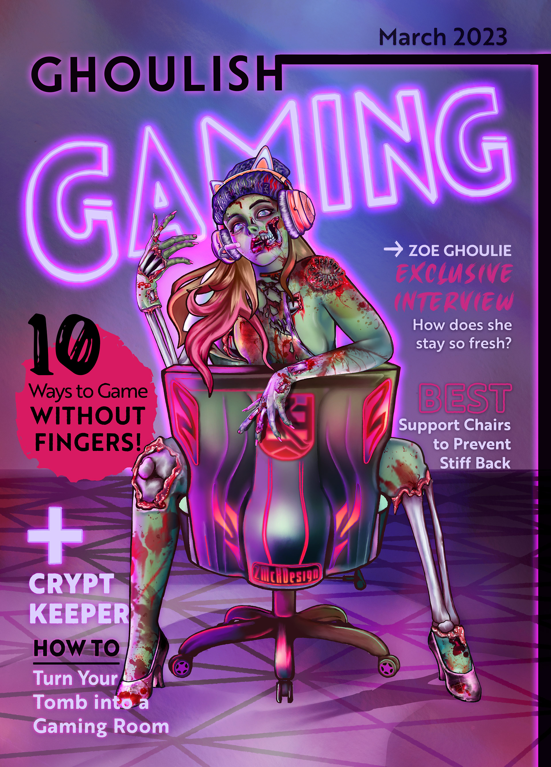
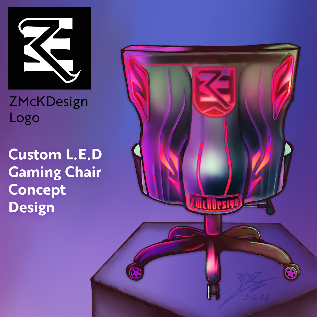
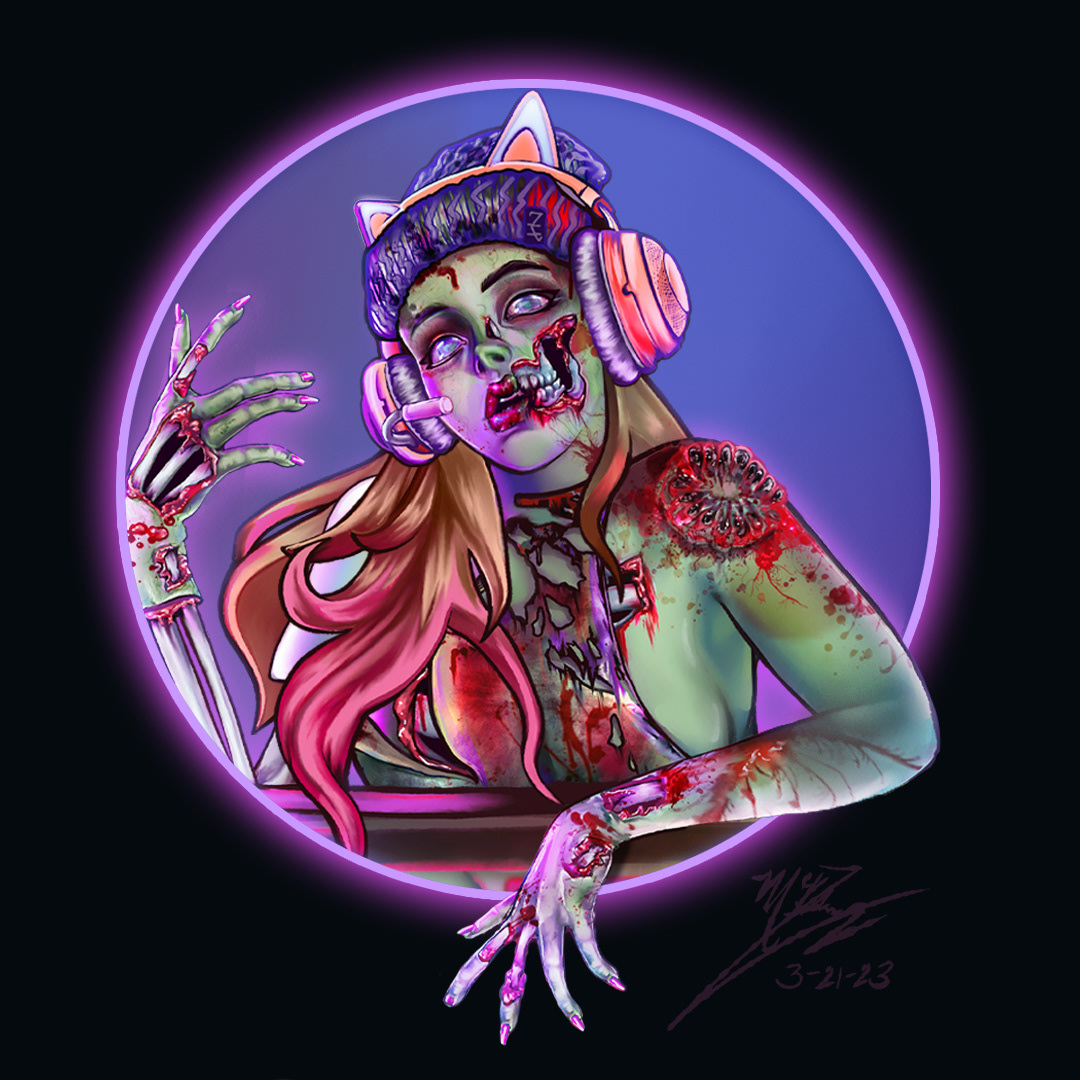
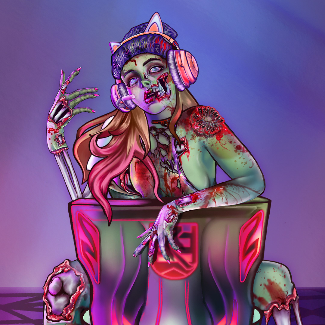
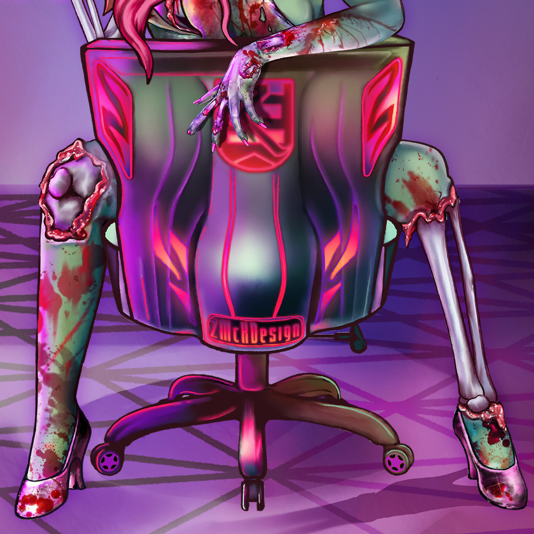
Ghoulish Gaming
March 21st, 2023.
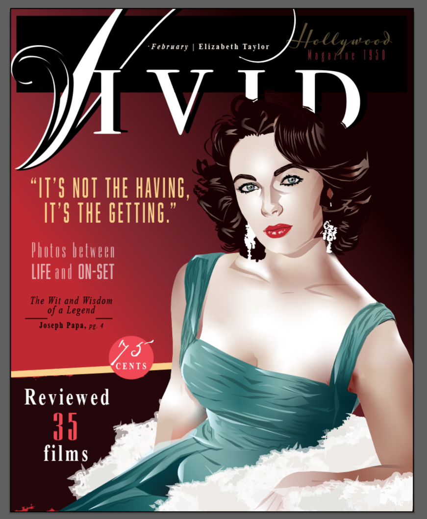
Zombie Gamer Girl Fantasy Portrait Magazine Concept Design.
This is from a zombie character DTiYS (Draw This In Your Style) challenge hosted on Instagram.
Work in Progress - Short 15 second video.
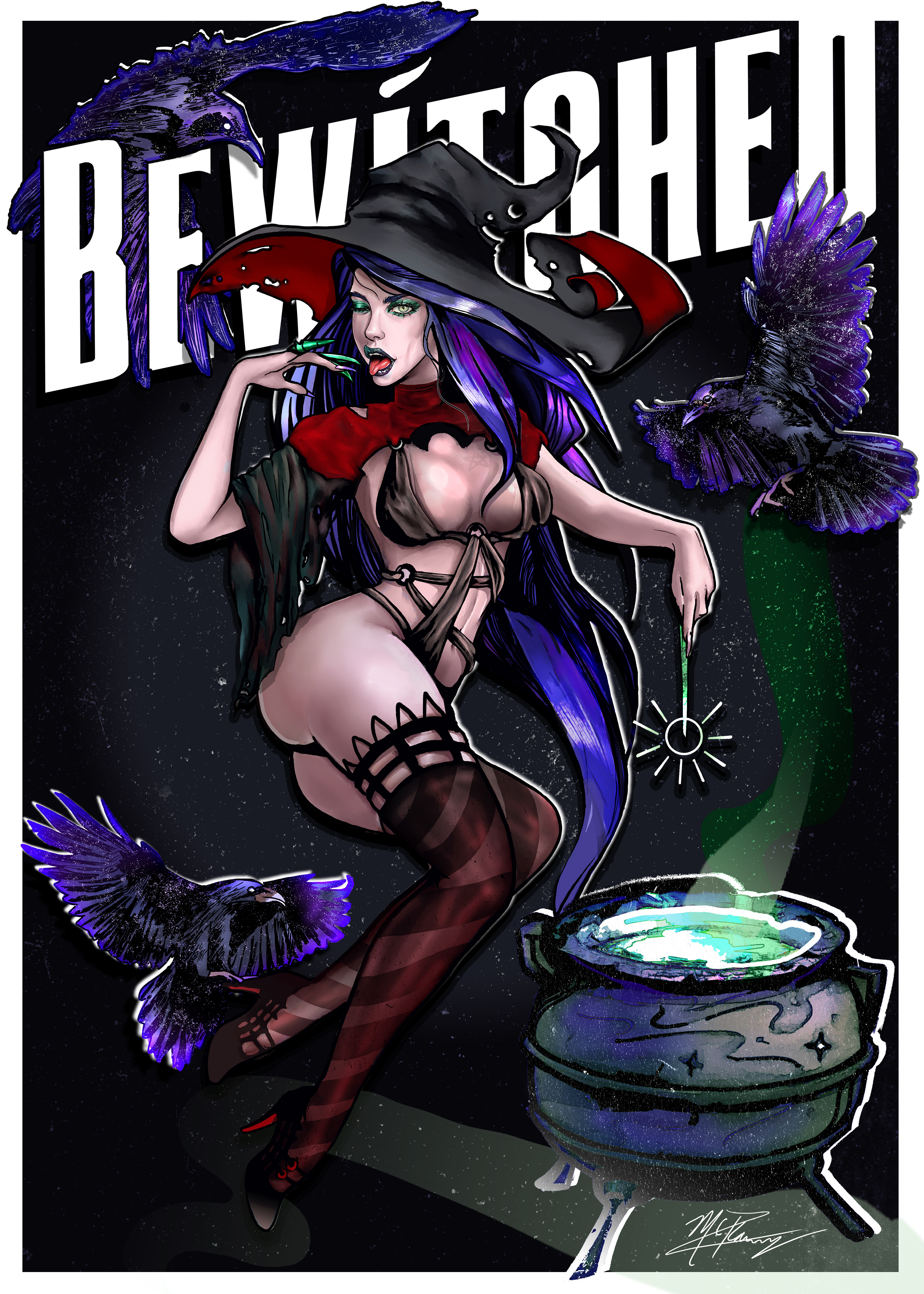
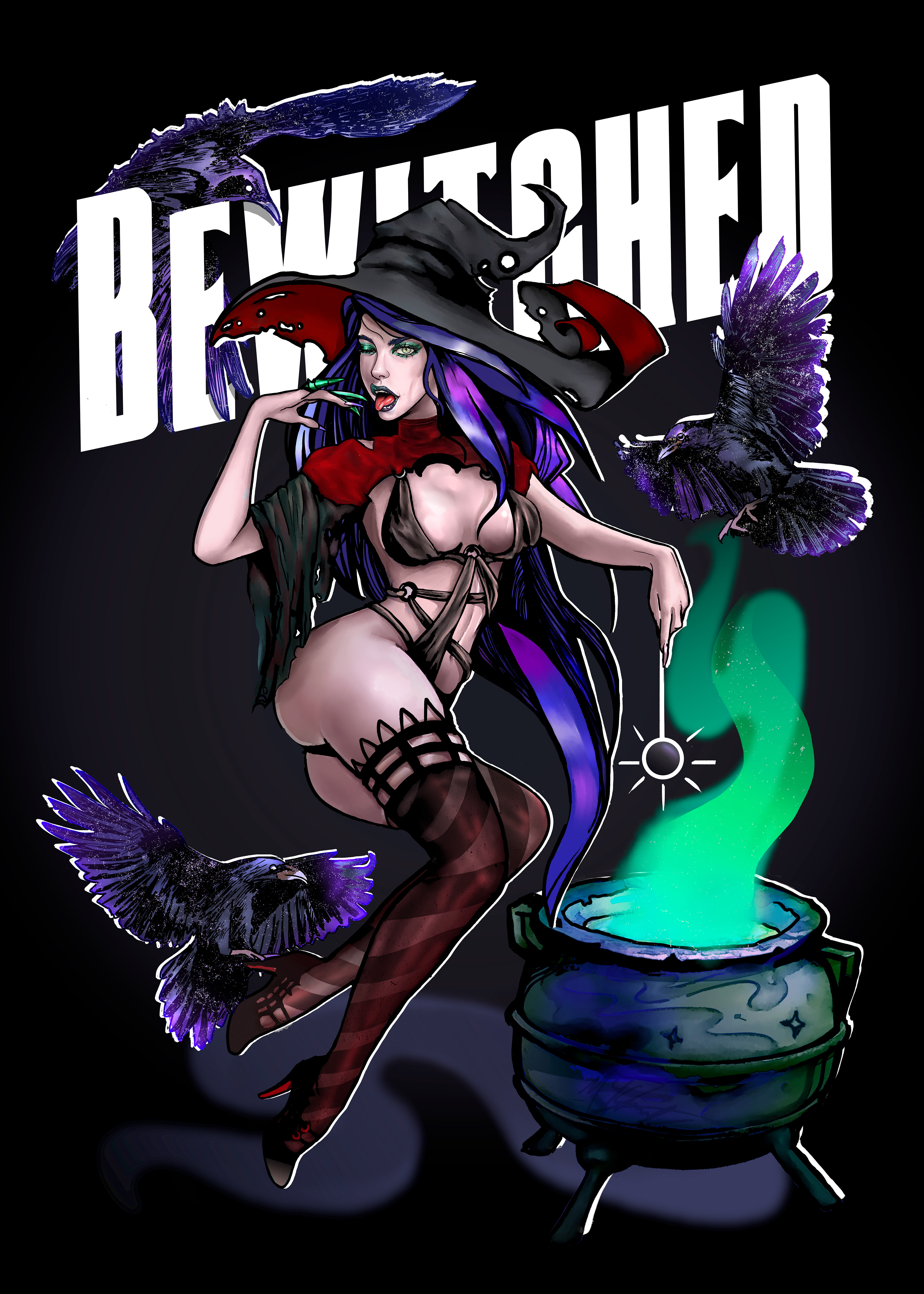
"Bewitched, Simple."
December 1st, 2022.
Final Poster Edit without busy background.
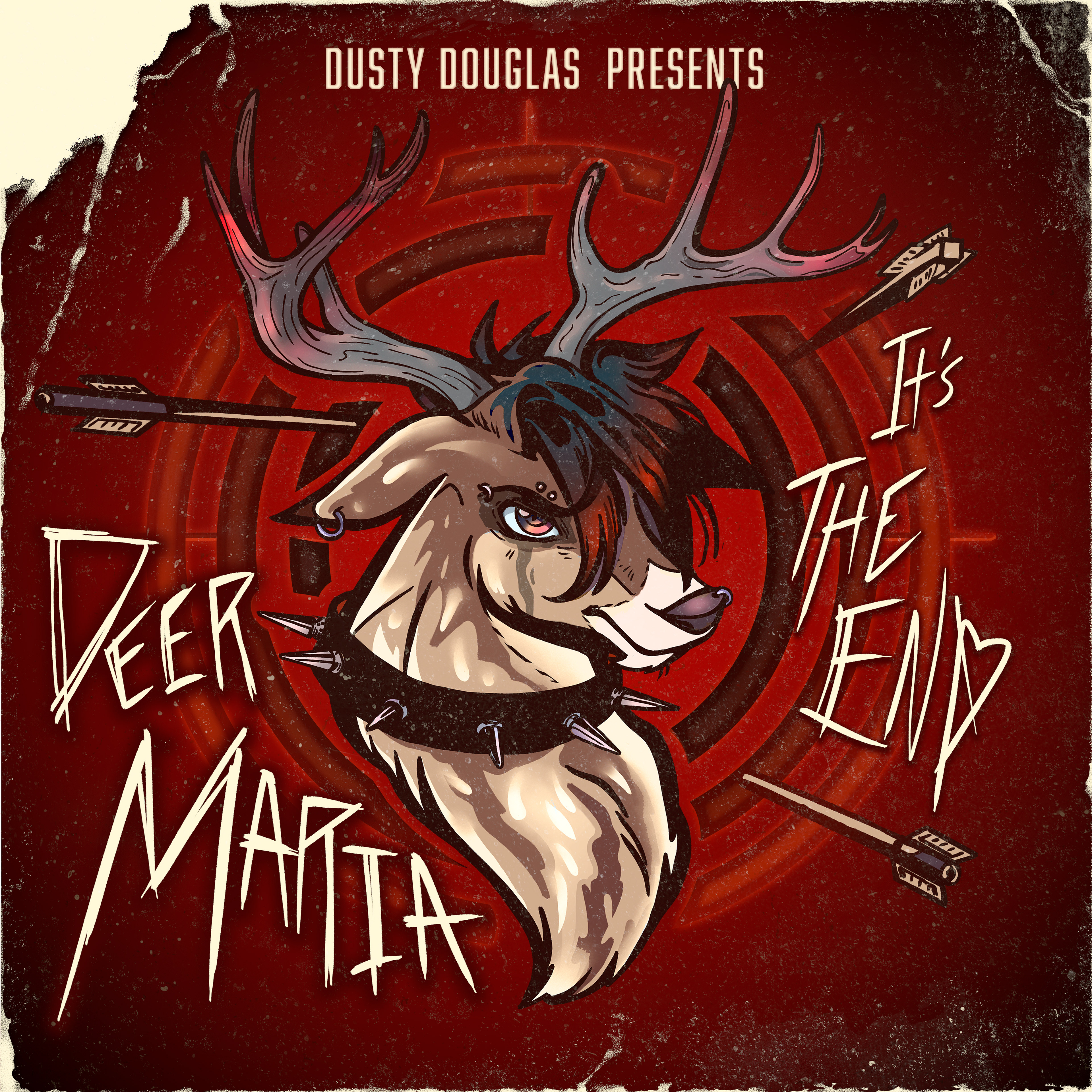
"Deer Maria, It's The End"
December 1st, 2022.
Emo Buck/Deer Album Cover Art Commission for @dustymdouglas
This is for Mr. Dusty's parody single of All Time Low's "Dear Maria." He'll have his cool track out soon!
Deer/Buck Speed Paint Process Full Video.
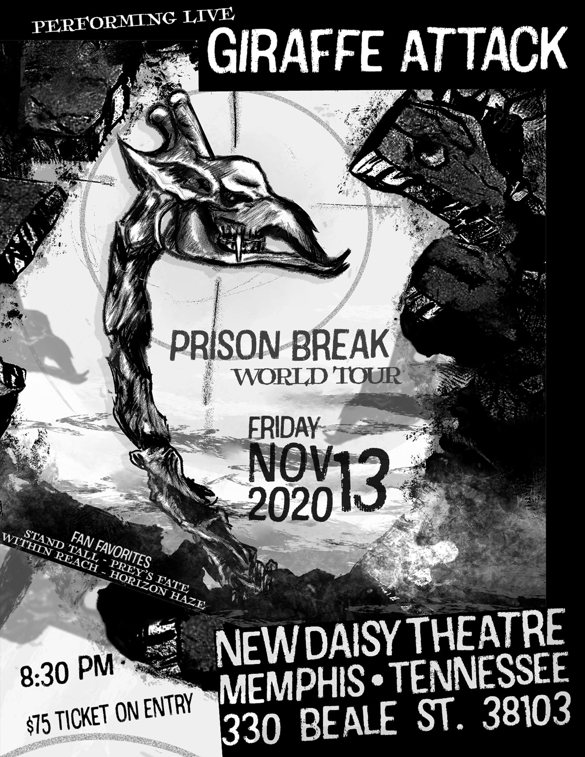
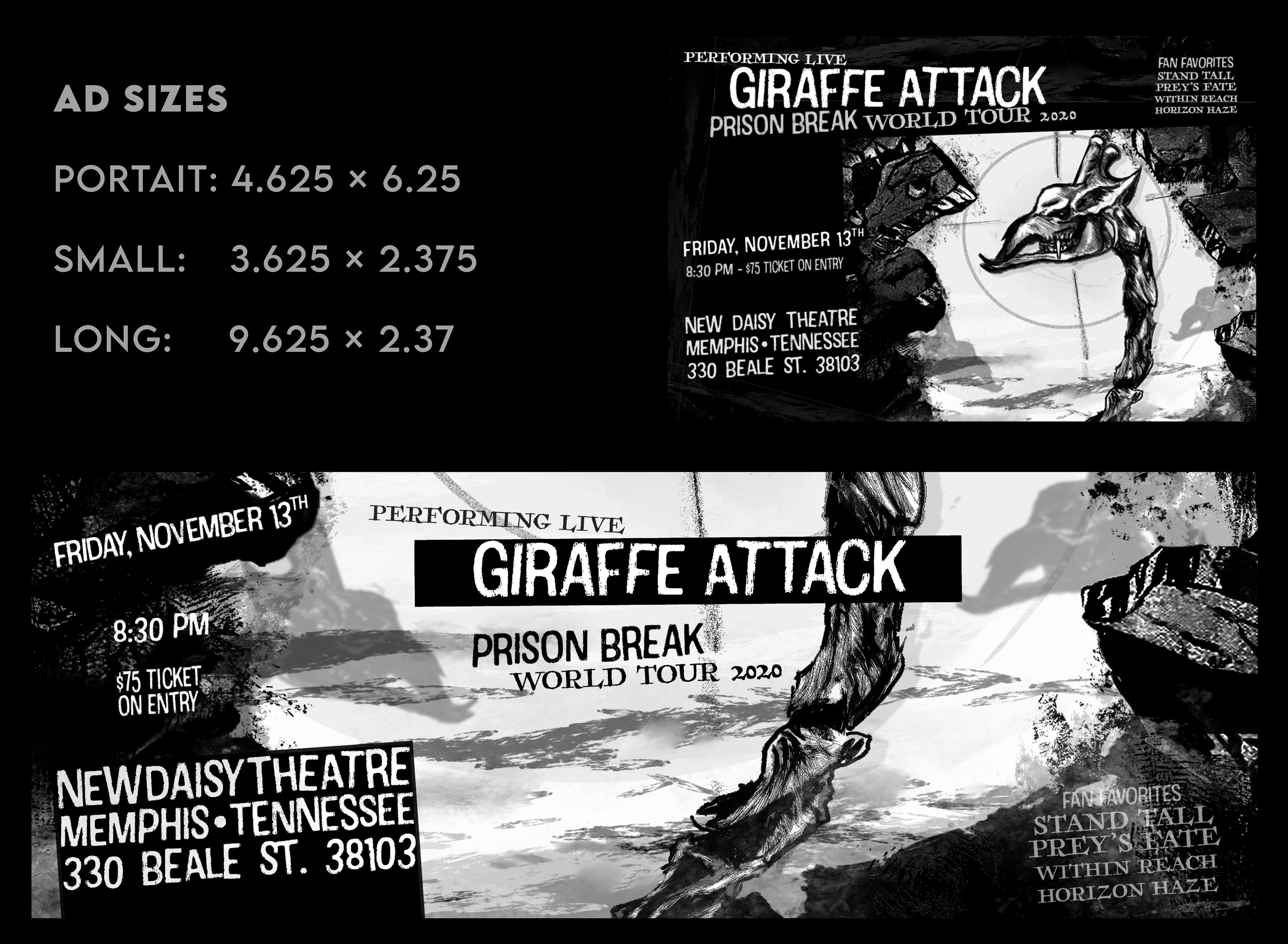
Small & Long Ads
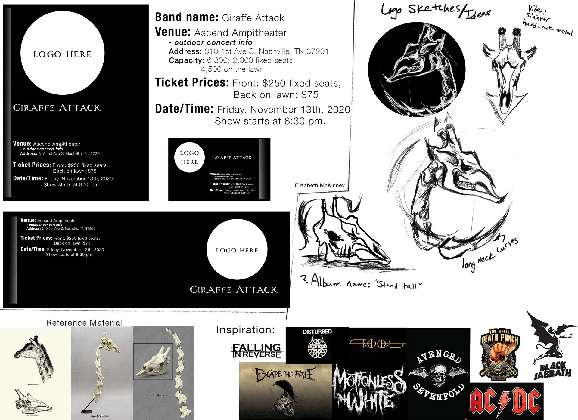
Work in Progress - Sketches - August 24th, 2020
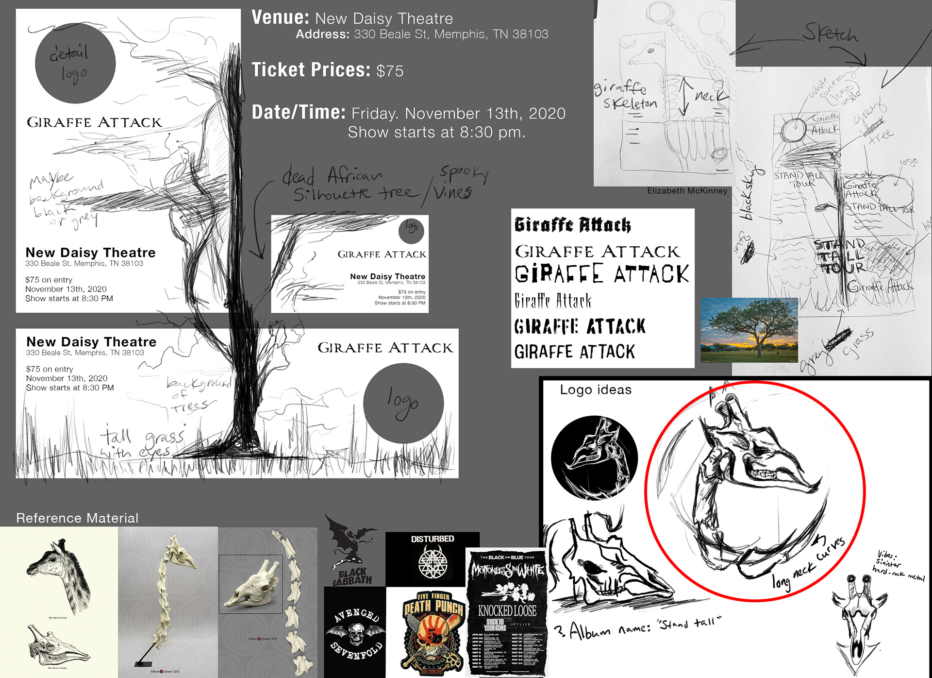
Work in Progress - Sketches - August 25th, 2020
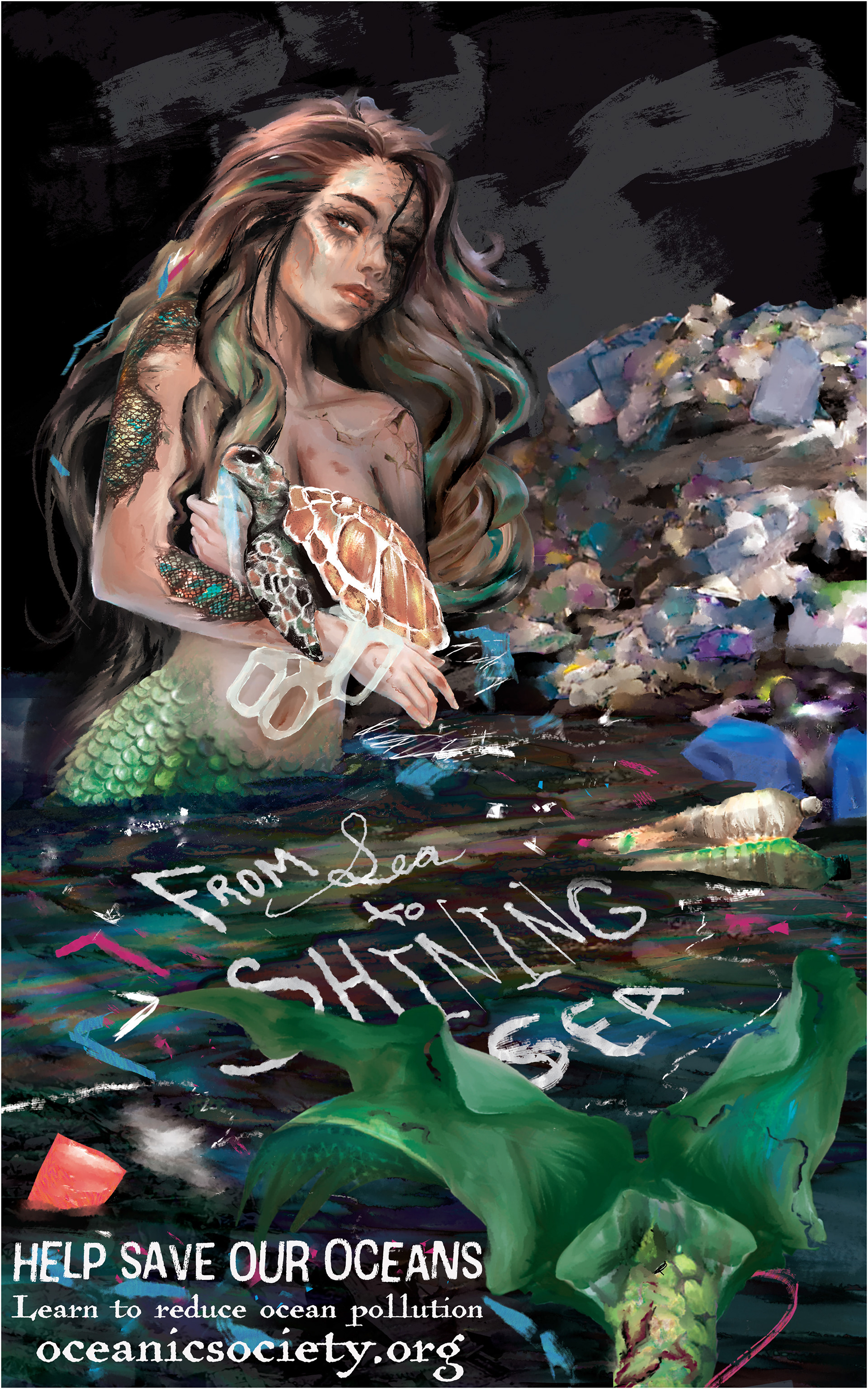
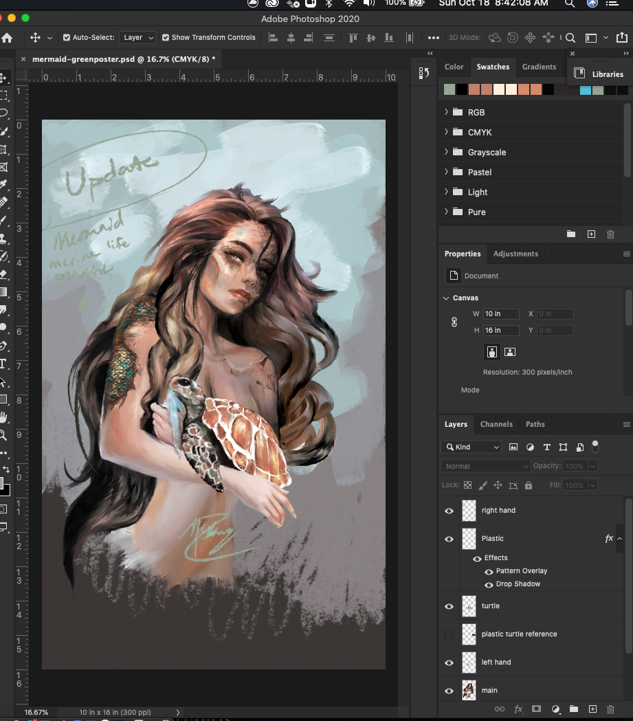
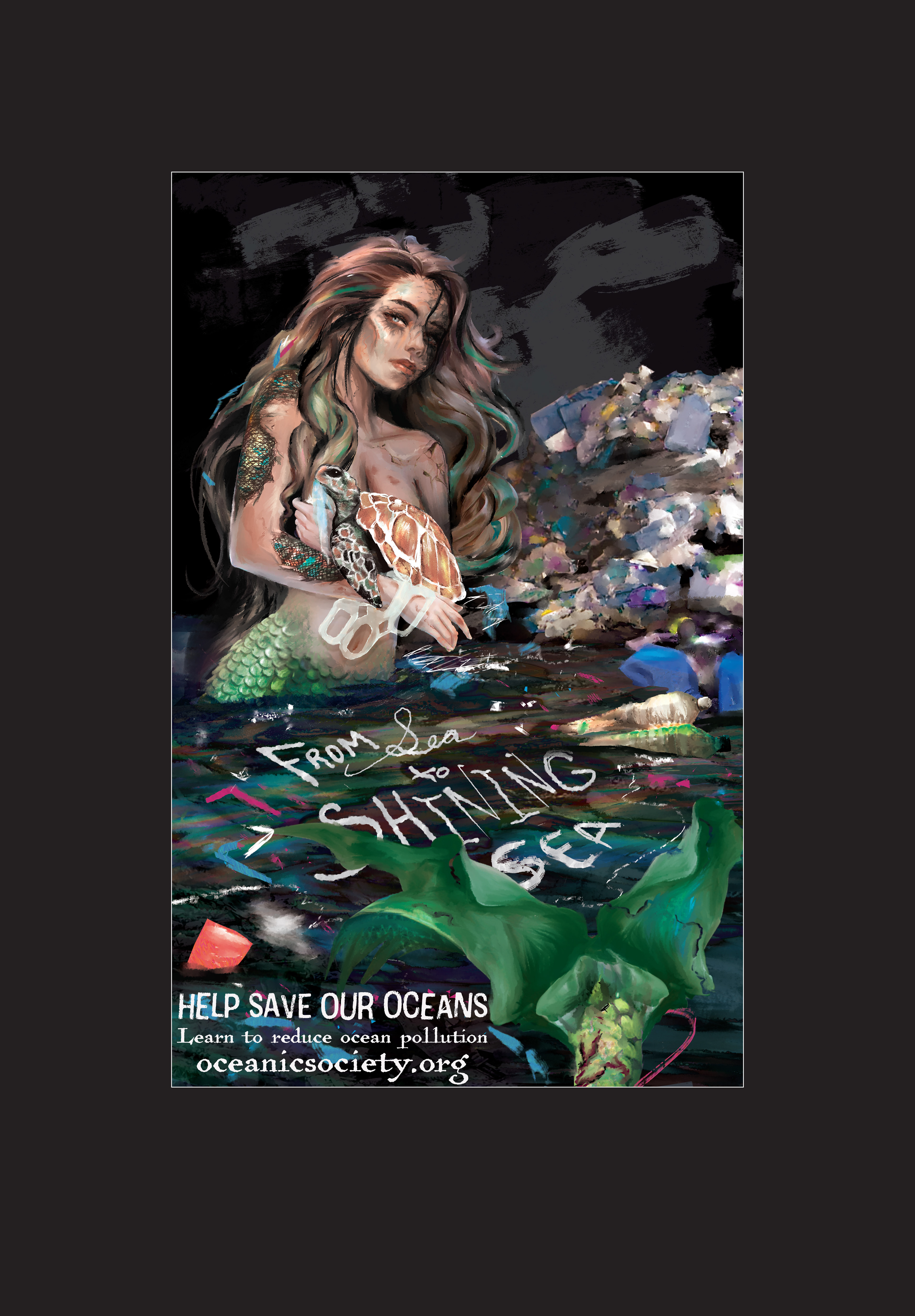
Green Poster
Reduce Plastic Pollution in the ocean.
Learn more ways to help by visiting oceanicsociety.org [ https://www.oceanicsociety.org/ ]
October 25th, 2020
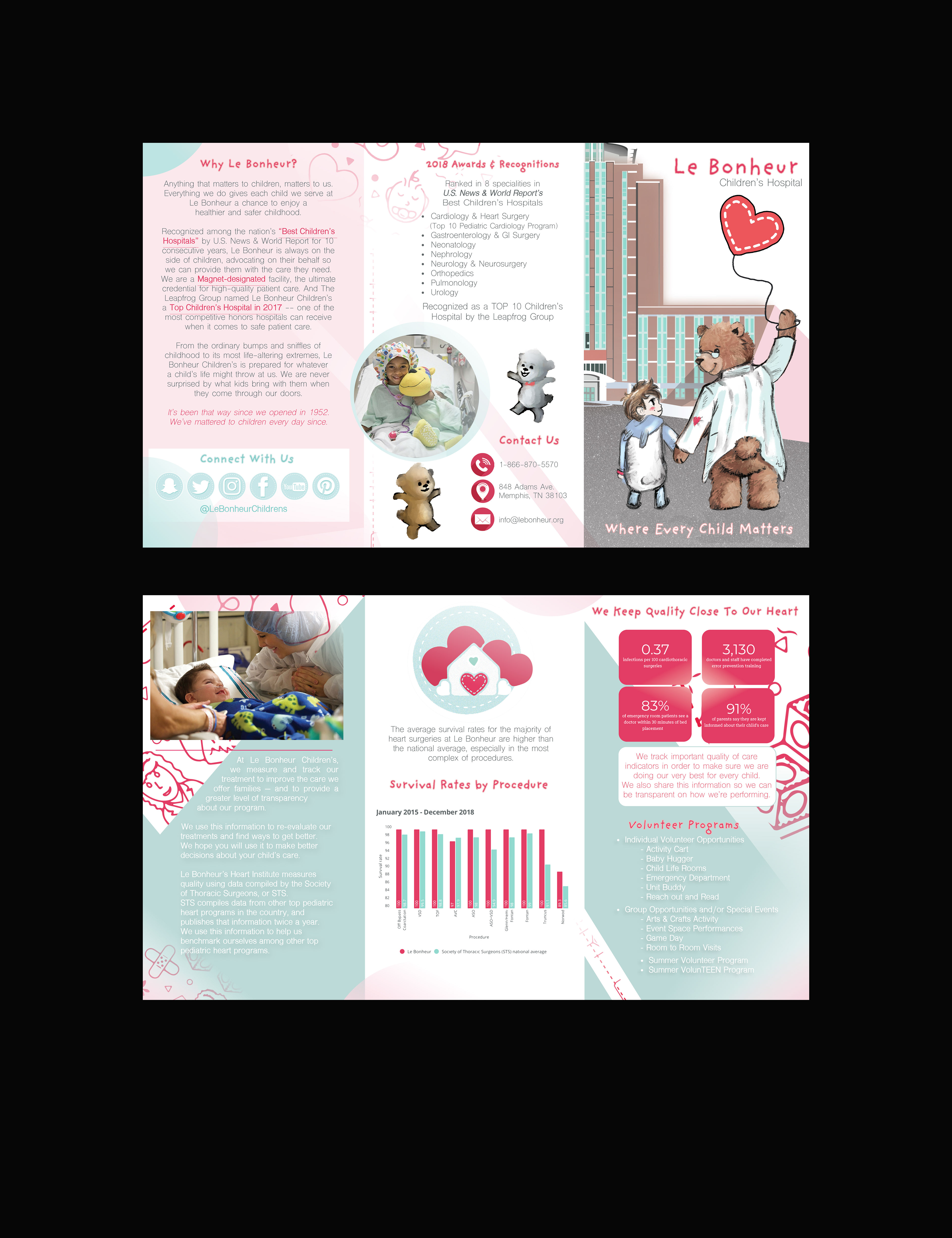
Brochure Trifold, Nonprofit Organization.
I chose Le Bonheur Children’s Hospital.
Completed: September 23, 2020
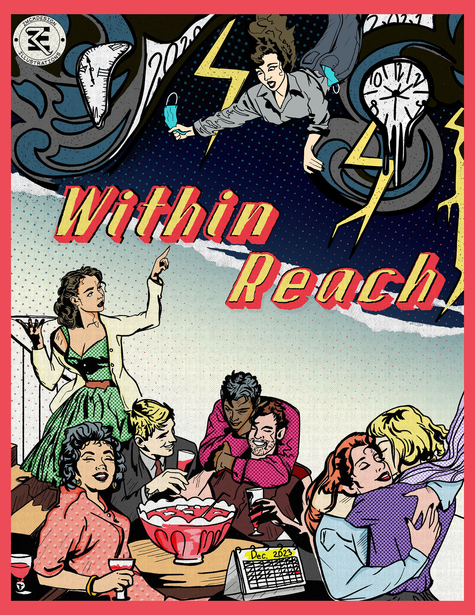
Within Reach. 1950s Comic Portrait.
September 23rd, 2021.
Class: Design Practice Studio
I studied 1950s comic art style to make a cover that expresses an optimistic view: "Good times are coming! We're within reach."
The girl falling is trying to escape from 2020-2021 years and skip to a better future (possibly December 2023 where things may be safer and people can party without being terrified of the deadly Covid-19 plague??? Who knows?).
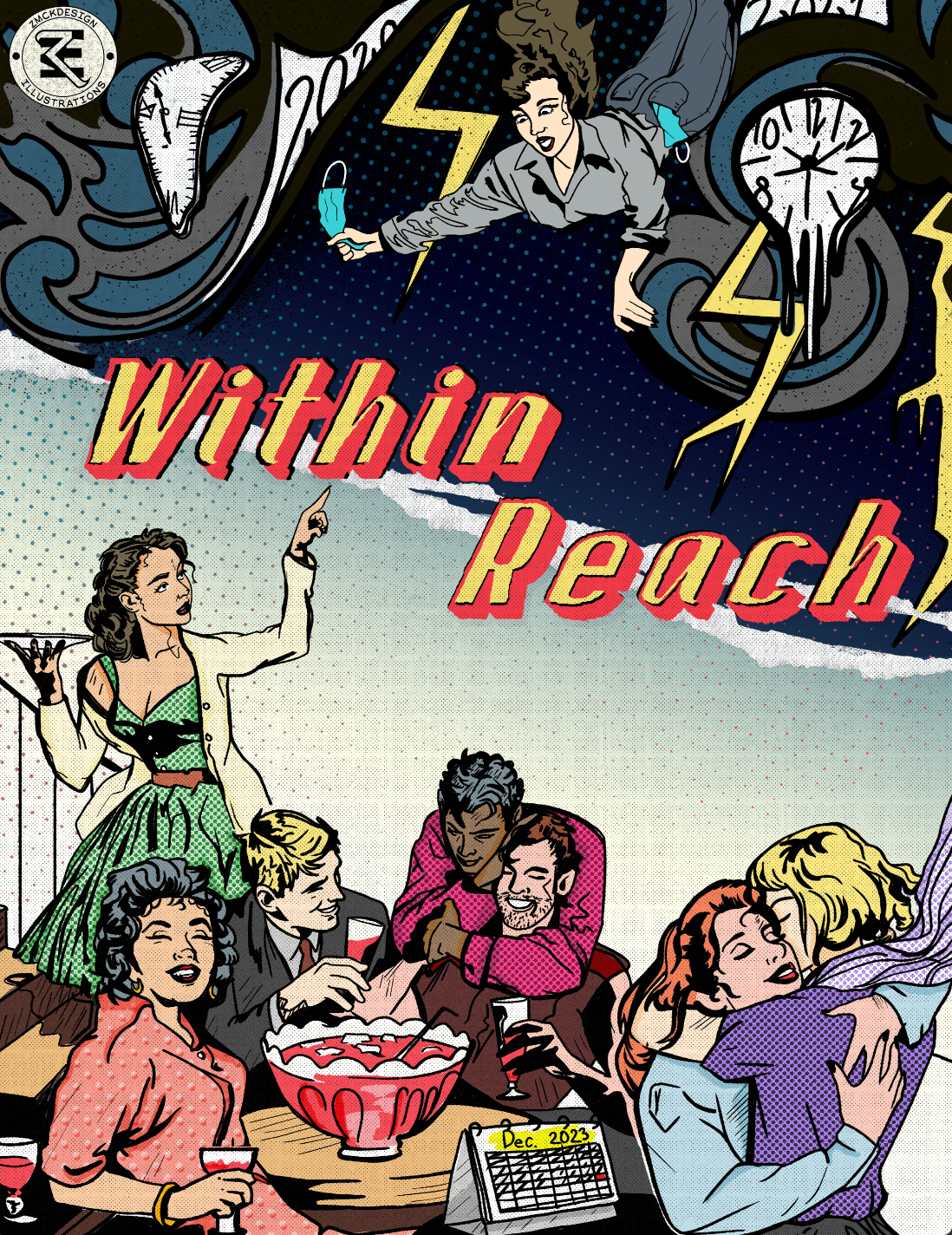
Final without red boarder
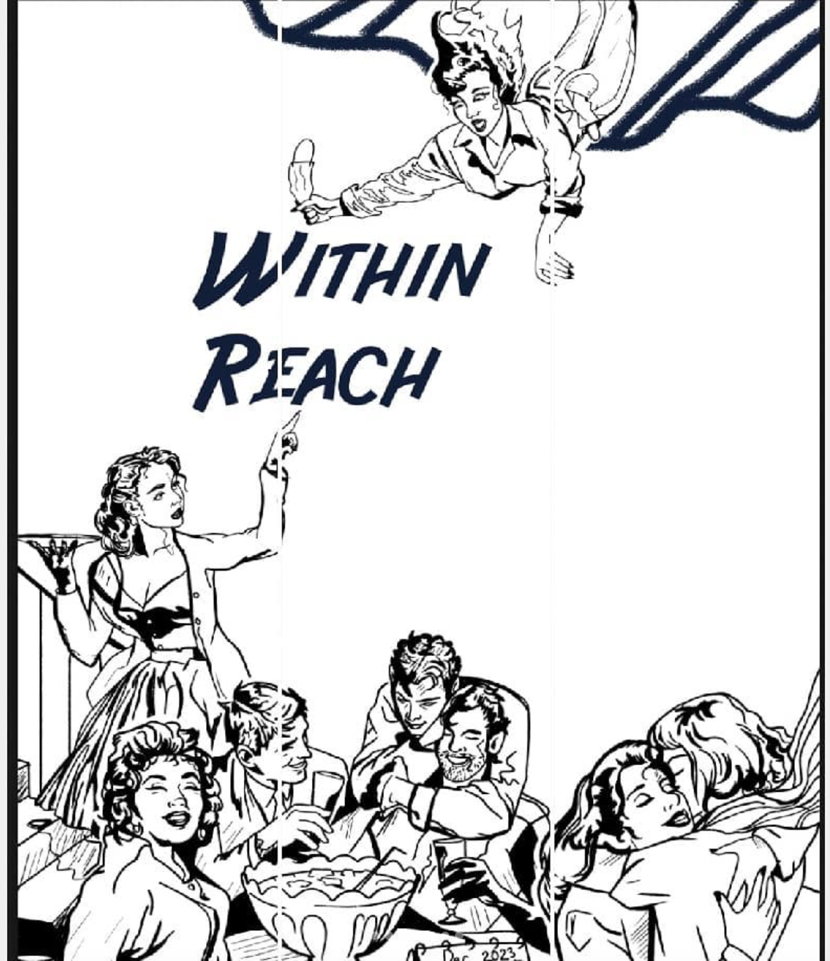
Beginning Sketching layout
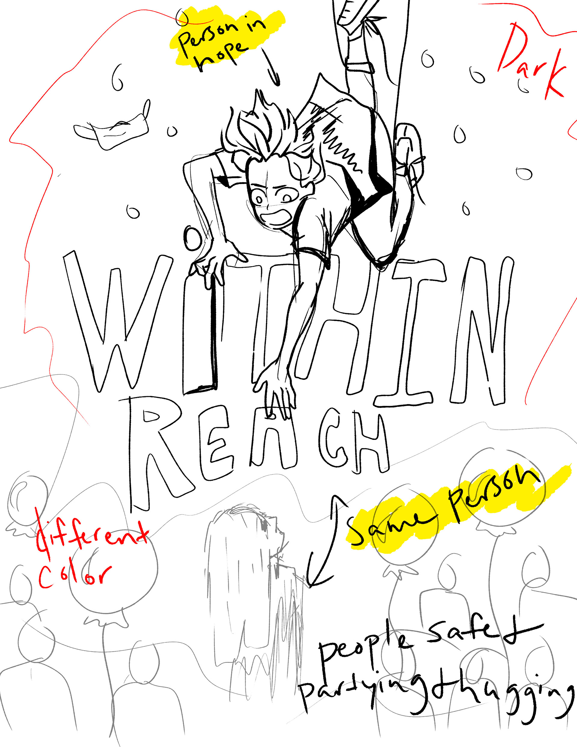
Idea First Sketch
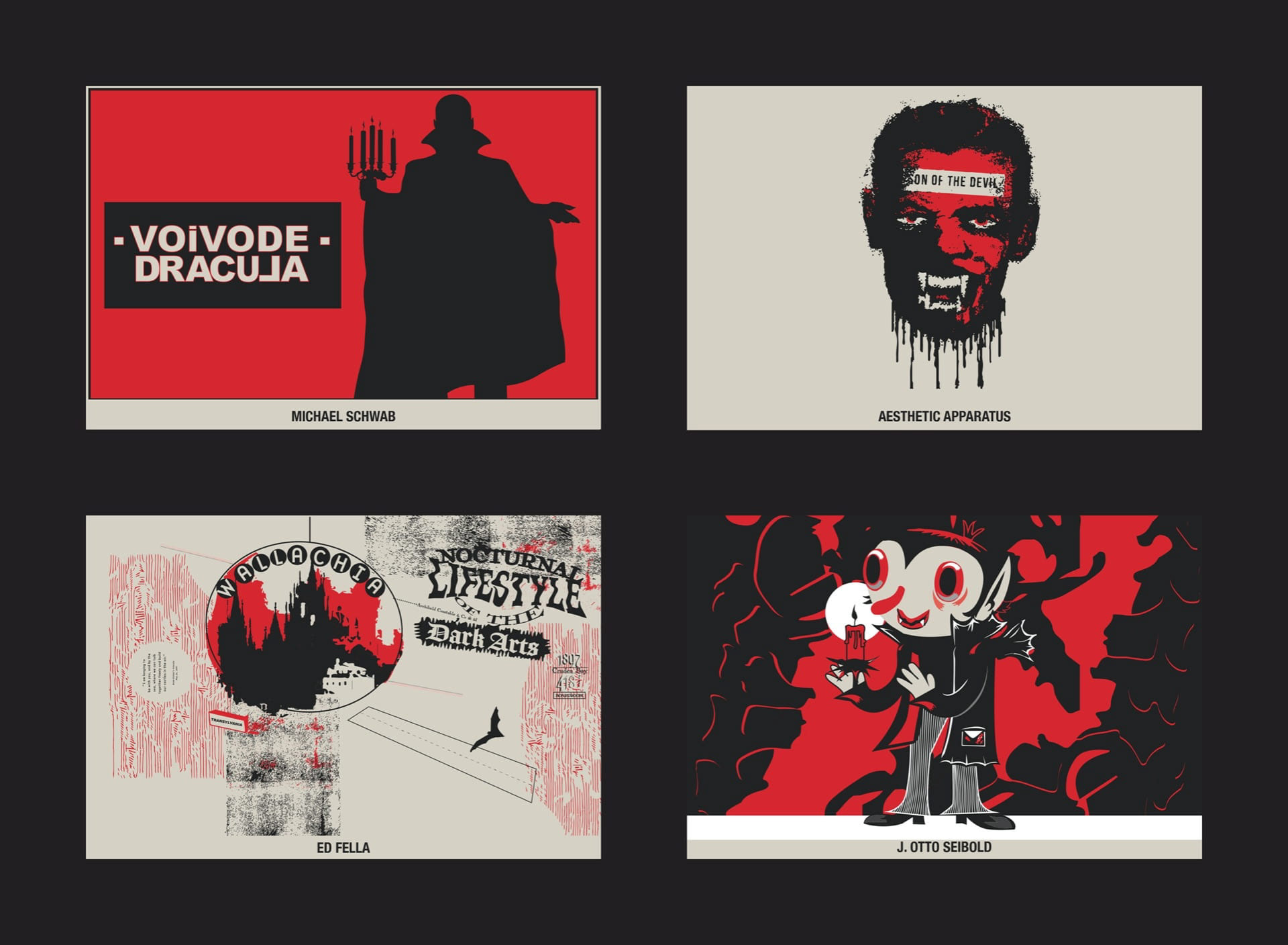
Assignment 3 | Postcards
“I am longing to be with you, and by the sea, where we can talk together freely and build our castles in the air.” – Bram Stoker, 1897
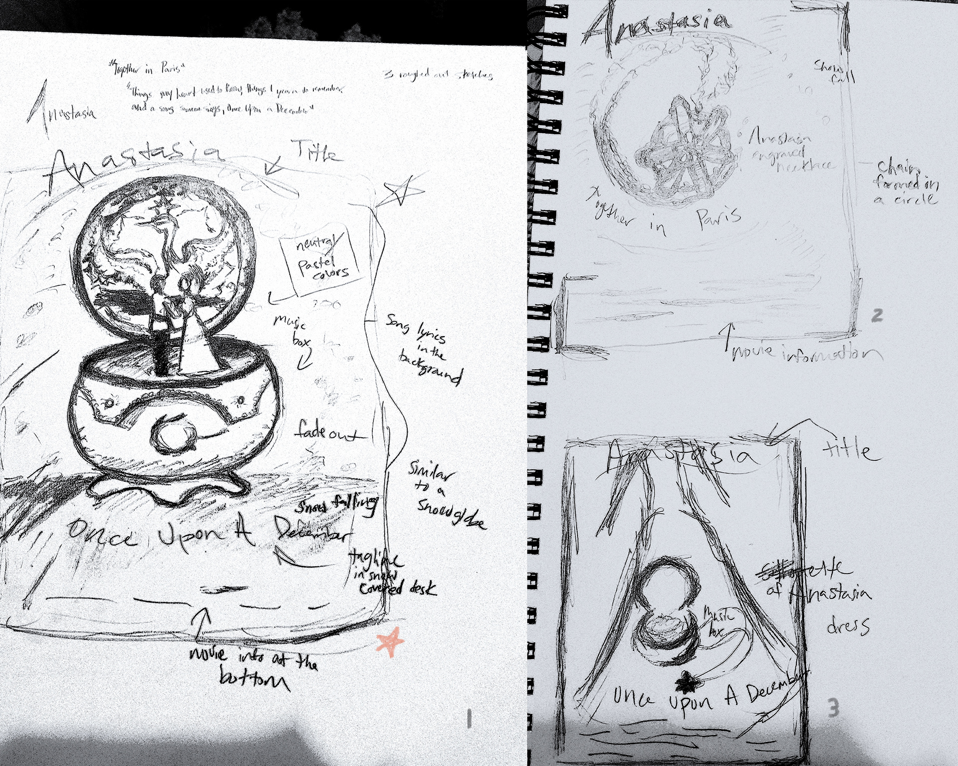
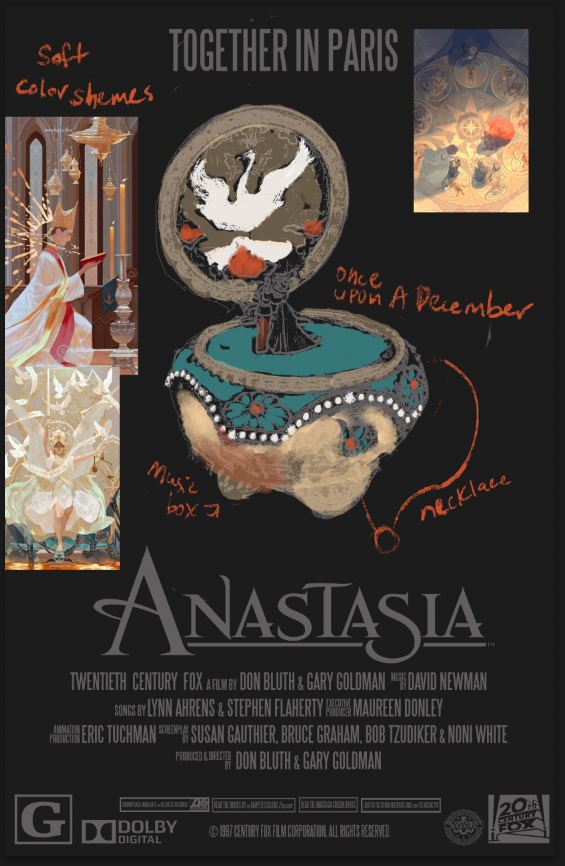
Pre-Sketches
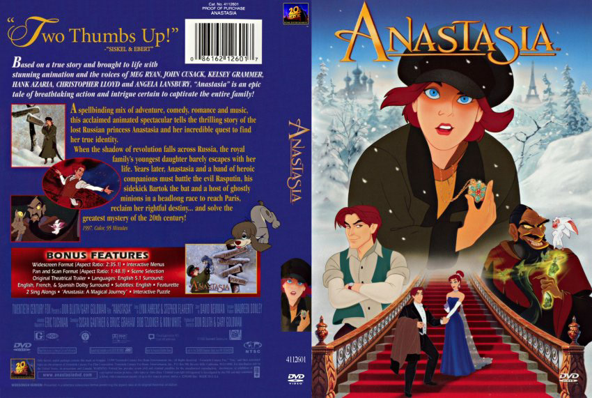
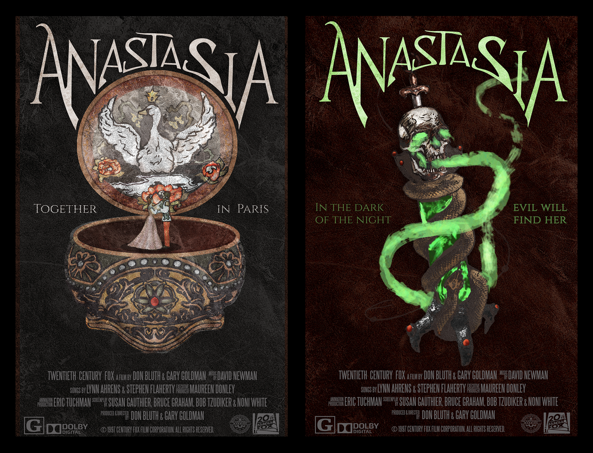
Anastasia DvD Cover Reference
Work in Progress #1
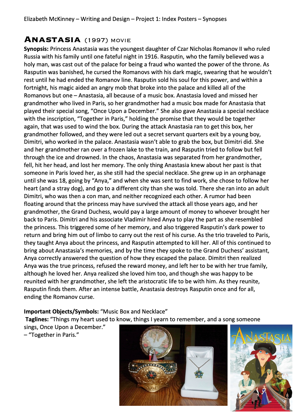
Anastasia Movie Synopsis

Gatsby's Mansion Simile - Blue Mansion Lighthouse First Version
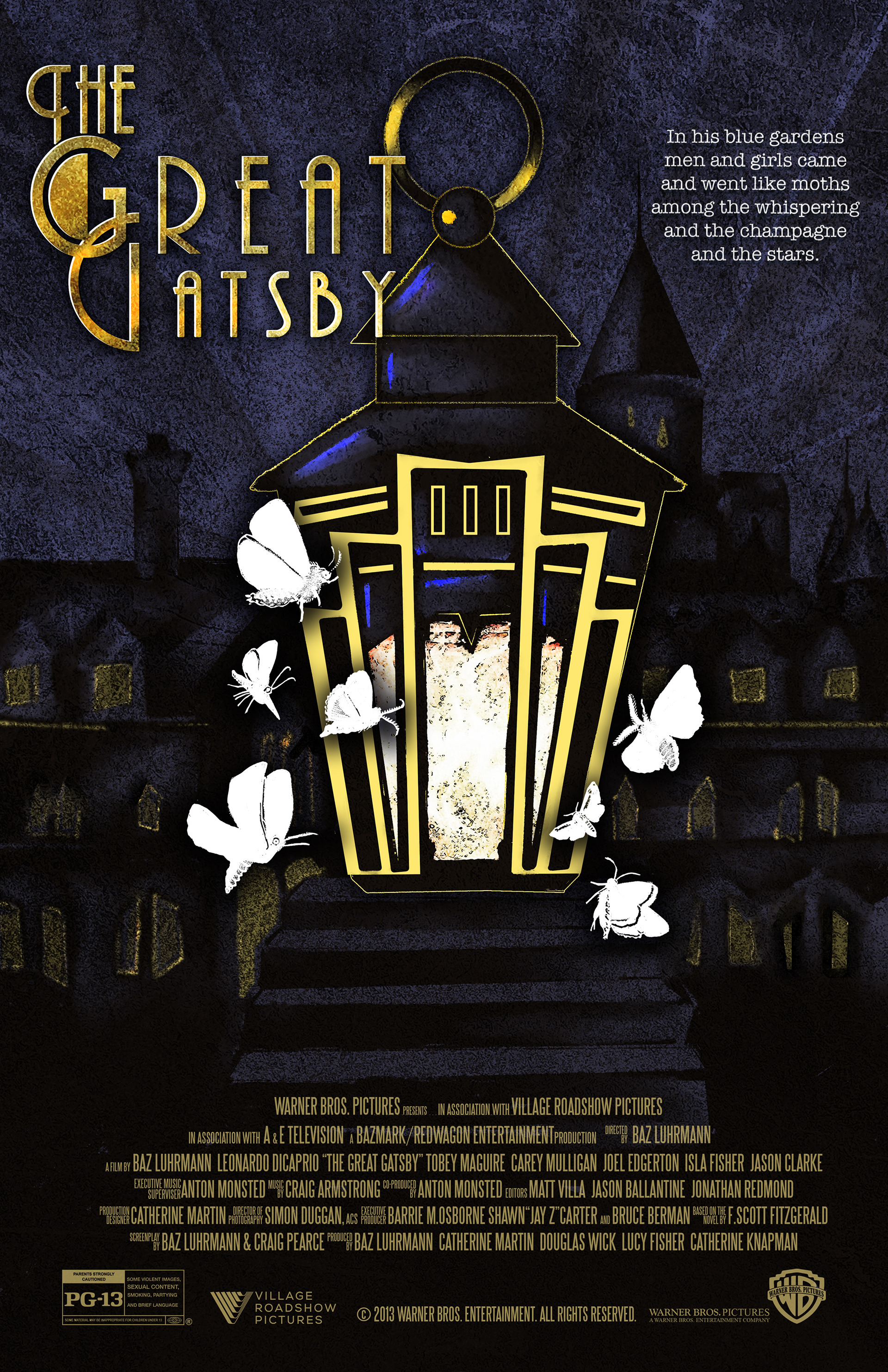
Lantern Simile - Great Gatsby Manor
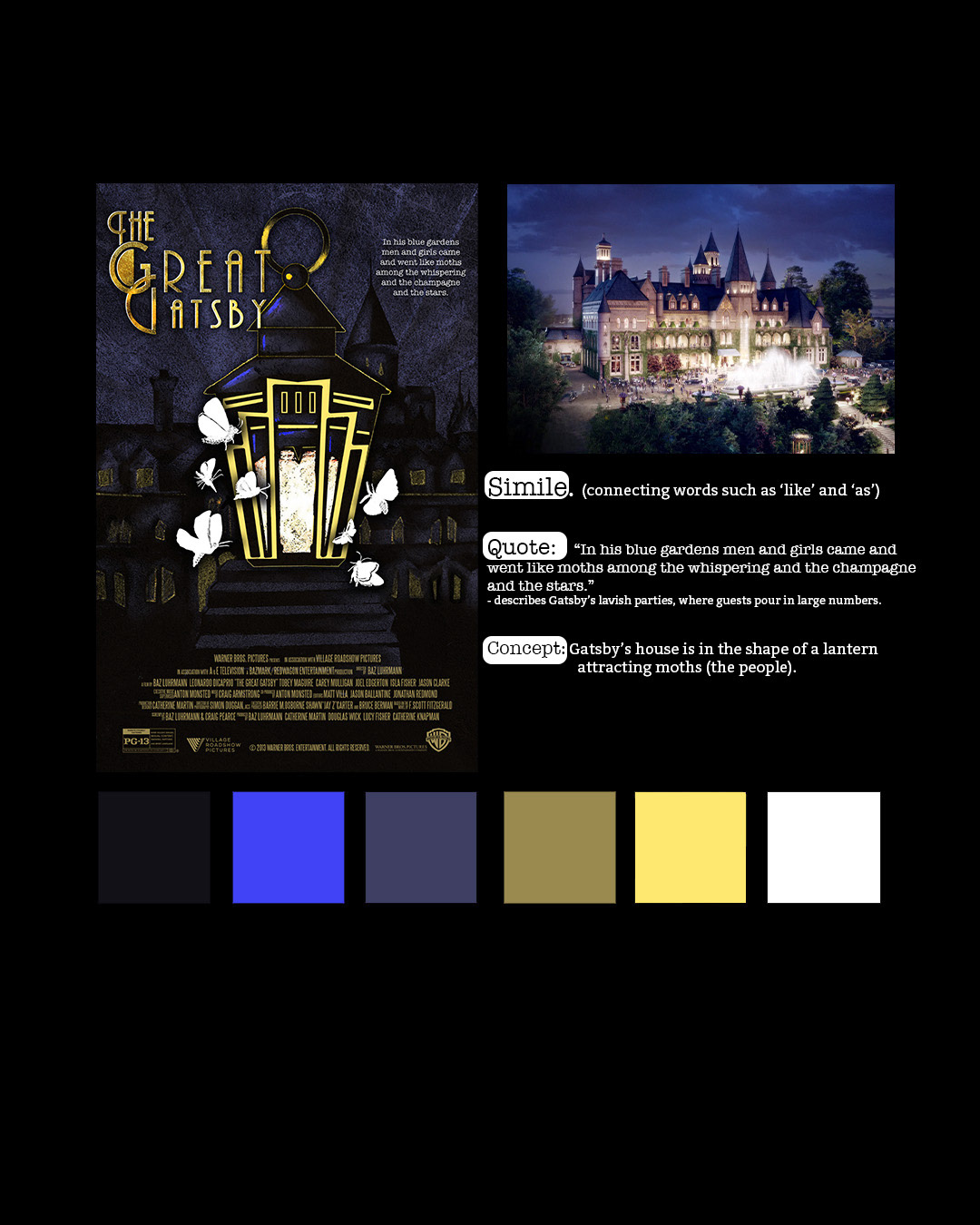
Simile: Explanation & Color Theme
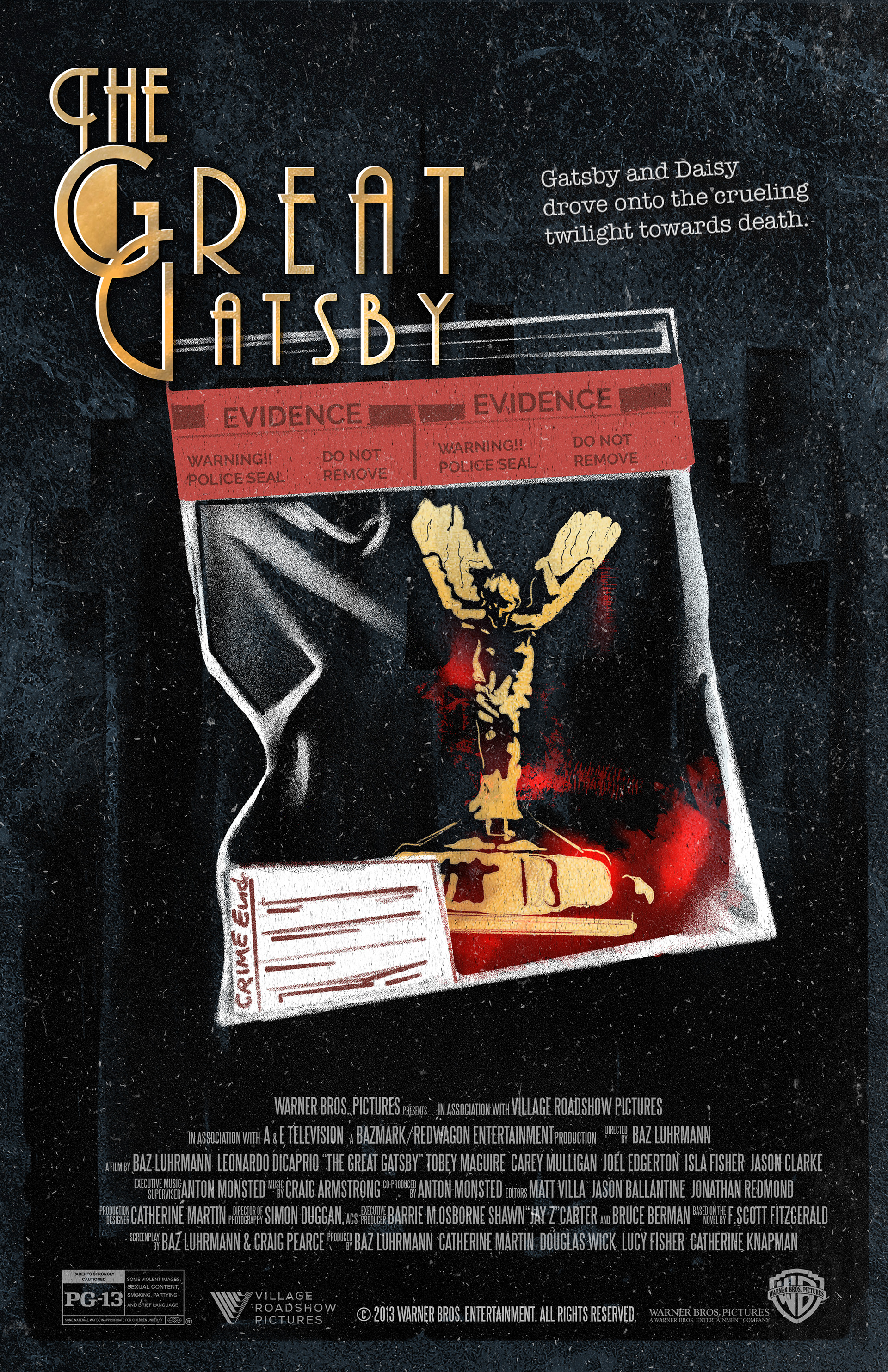
The Great Gatsby: Yellow Car Head Ornament
(Juxt Position)
Completed in Spring 2021
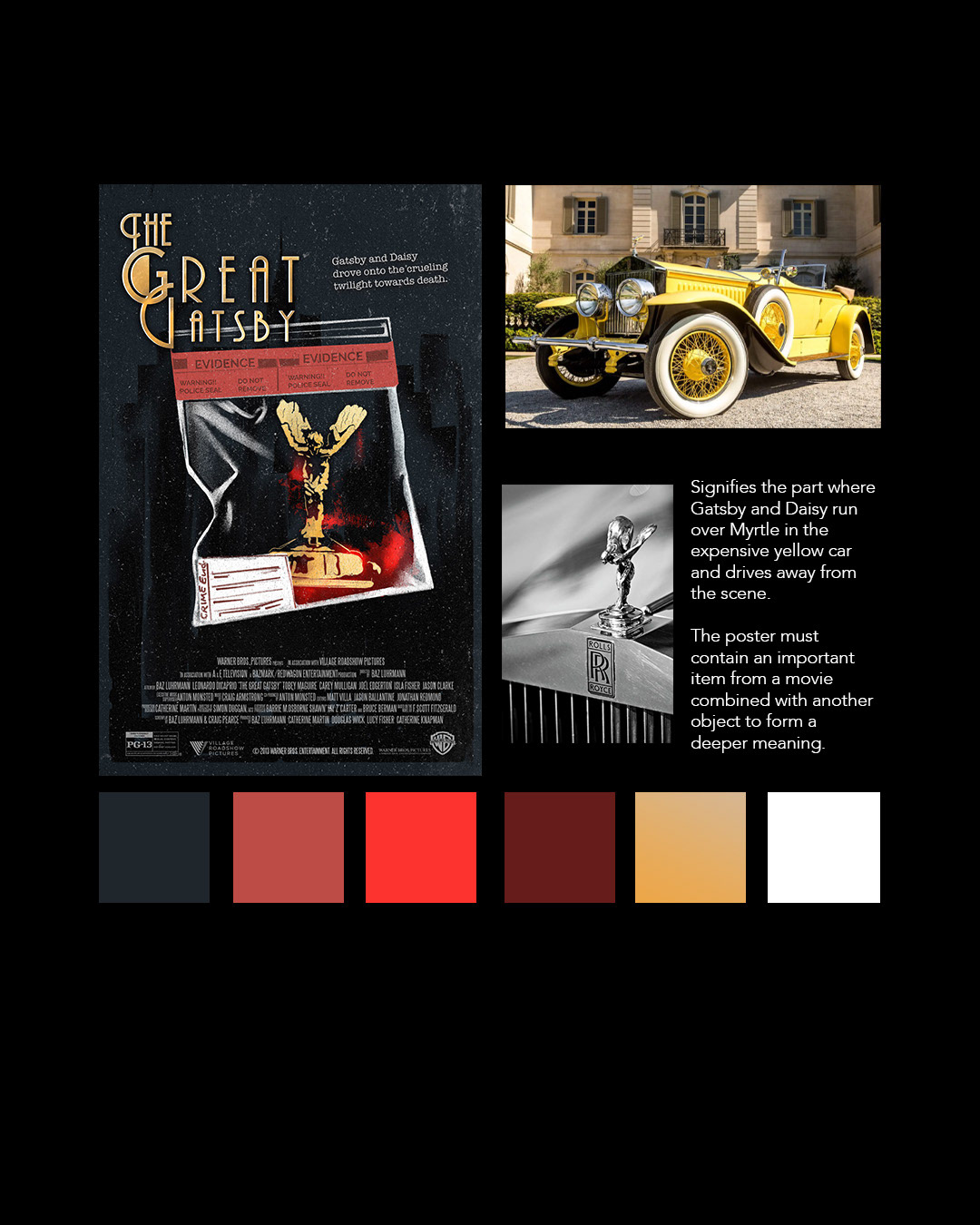
Just Position: Color Theme & Explanation
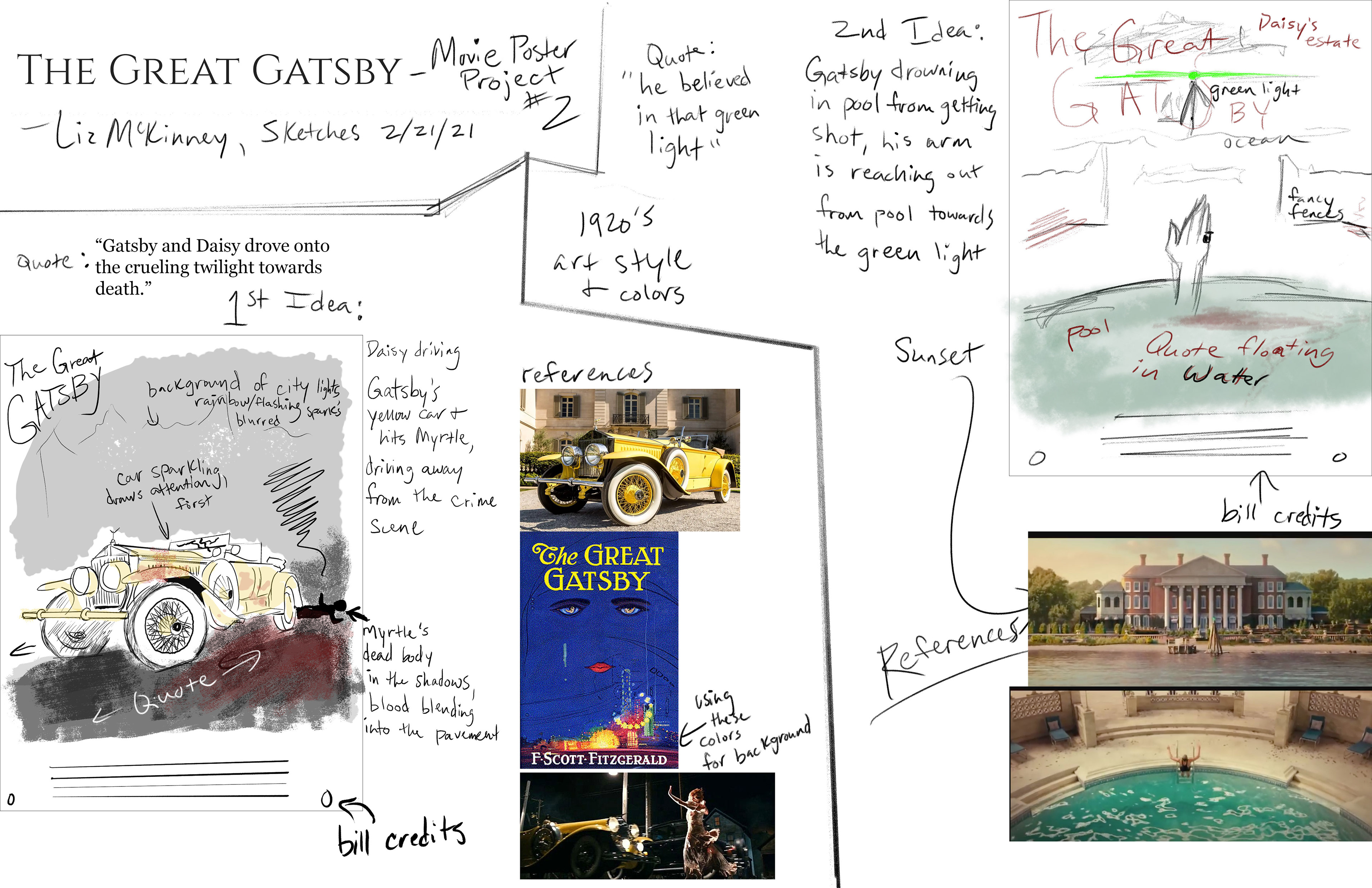
Pre-Sketches
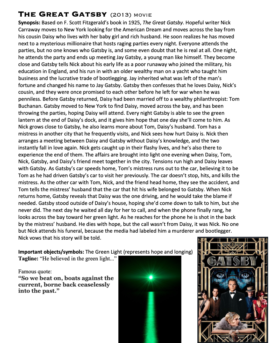
Great Gatsby Movie Synopsis
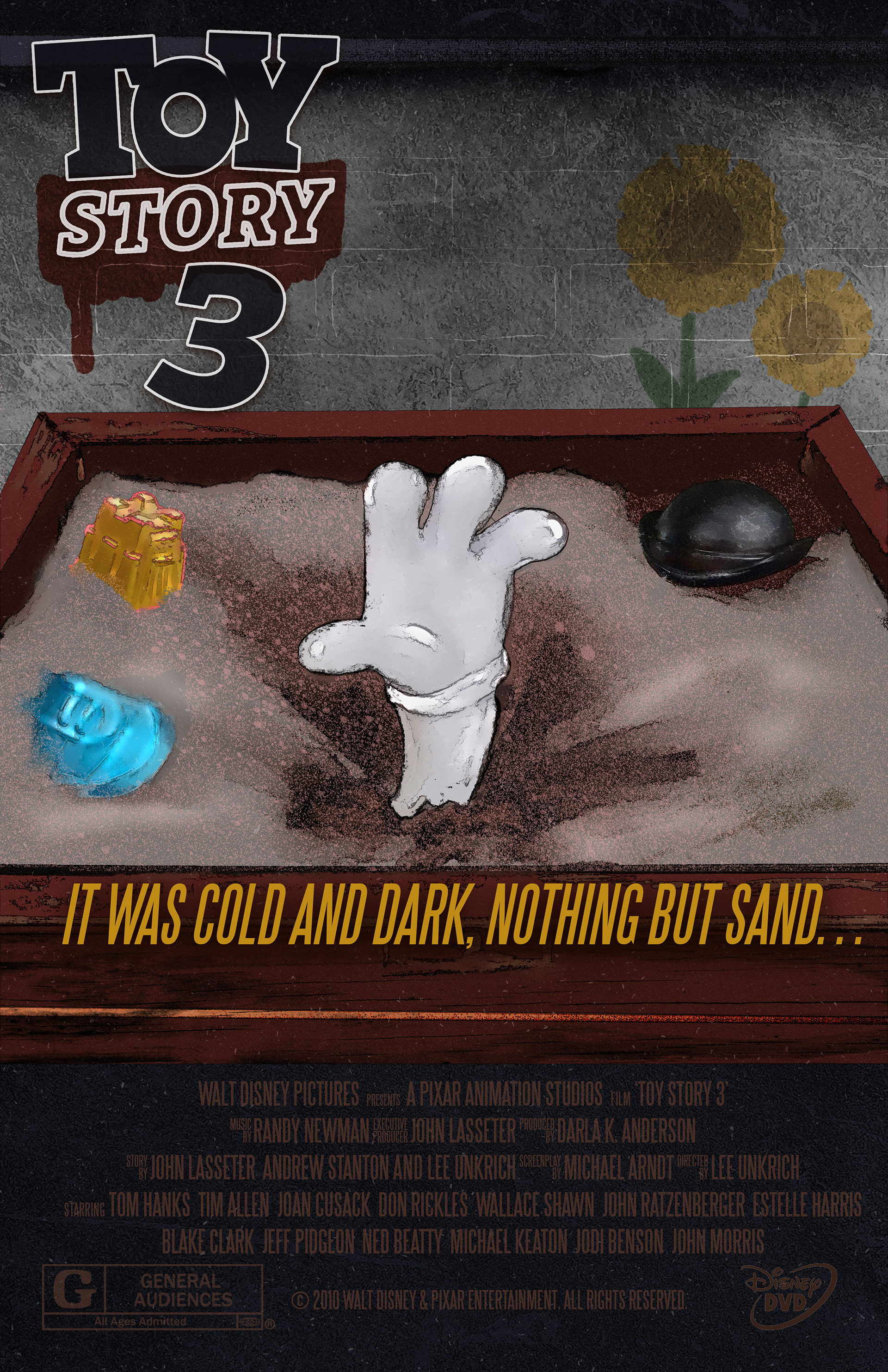
Toy Story 3, Mr. Potato Head Sandbox

Metaphor: Color Theme & Explanation