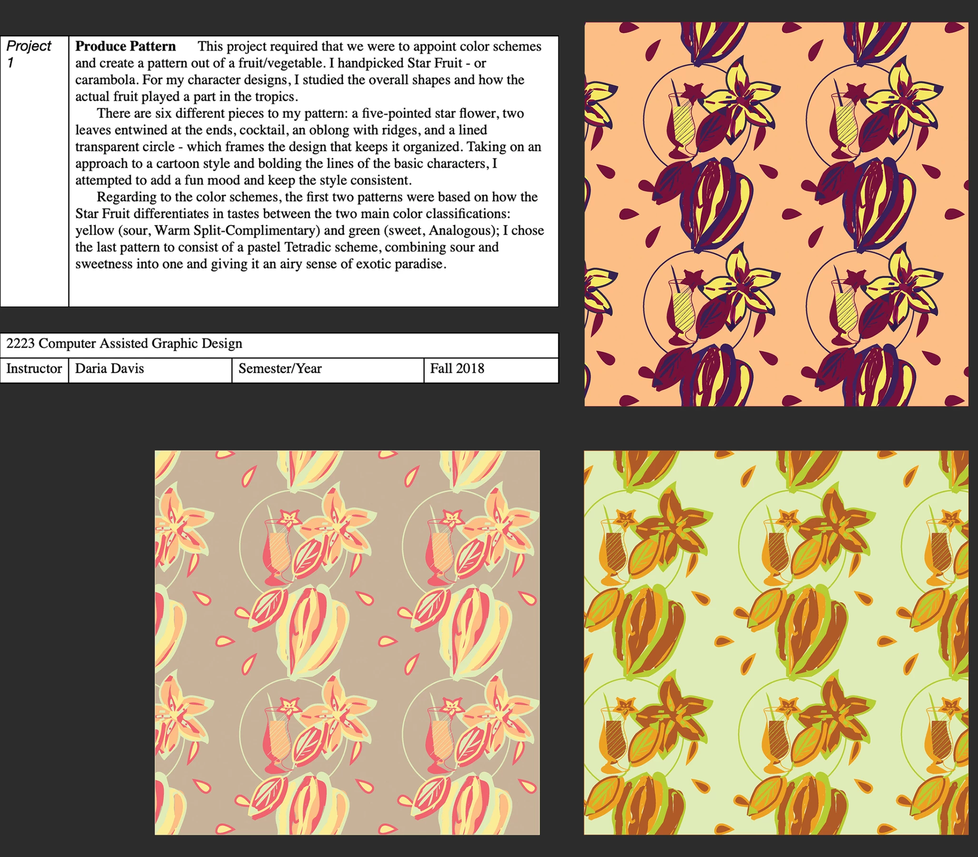
Fall 2018, 2223 Computer Assisted Graphic Design
Project 1 - Produce Pattern: This project required that we were to appoint color schemes and create a pattern out of a fruit/vegetable. I handpicked Star Fruit - or carambola. For my character designs, I studied the overall shapes and how the actual fruit played a part in the tropics. There are six different pieces to my pattern: a five-pointed star flower, two leaves entwined at the ends, cocktail, an oblong with ridges, and a lined transparent circle - which frames the design that keeps it organized. Taking on an approach to a cartoon style and bolding the lines of the basic characters, I attempted to add a fun mood and keep the style consistent. Regarding to the color schemes, the first two patterns were based on how the Star Fruit differentiates in tastes between the two main color classifications: yellow (sour, Warm Split-Complimentary) and green (sweet, Analogous); I chose the last pattern to consist of a pastel Tetradic scheme, combining sour and sweetness into one and giving it an airy sense of exotic paradise.

Fall 2018, 2223 Computer Assisted Graphic Design
Project 2 - The Hockney Montage: While attempting to imitate Hockney’s collage-like method, I had a fun photoshoot of my Shih Tzu / Chihuahua (ShiChi) mix in various angles. The stacking of the photos allowed me to show off her various expressions as she prances around and explores the garden. The background color helps bring out the vibrancy of the plants and convey happiness and springtime.
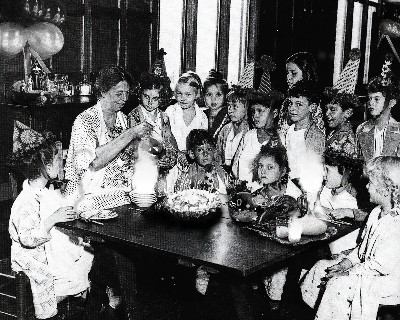
Fall 2018, 2223 Computer Assisted Graphic Design
Project 3 - The Photographic Lie: This project consisted of a historic image and a scanned self-image of the artist. The image that I manipulated was that of Eleanor Roosevelt visiting a progressive school. I inserted and edited a picture of my five-year-old self to blend in with the other children, my 19th birthday cheesecake, balloons, party hats, a science experiment with smoke, as well as neat Halloween décor. The project was assigned around Halloween and I wanted the party spirit to translate into my project. I added the science experiment to play with the viewer’s senses and give them a hint that not all things in this picture were supposed to be there.
Fall 2018, 2223 Computer Assisted Graphic Design
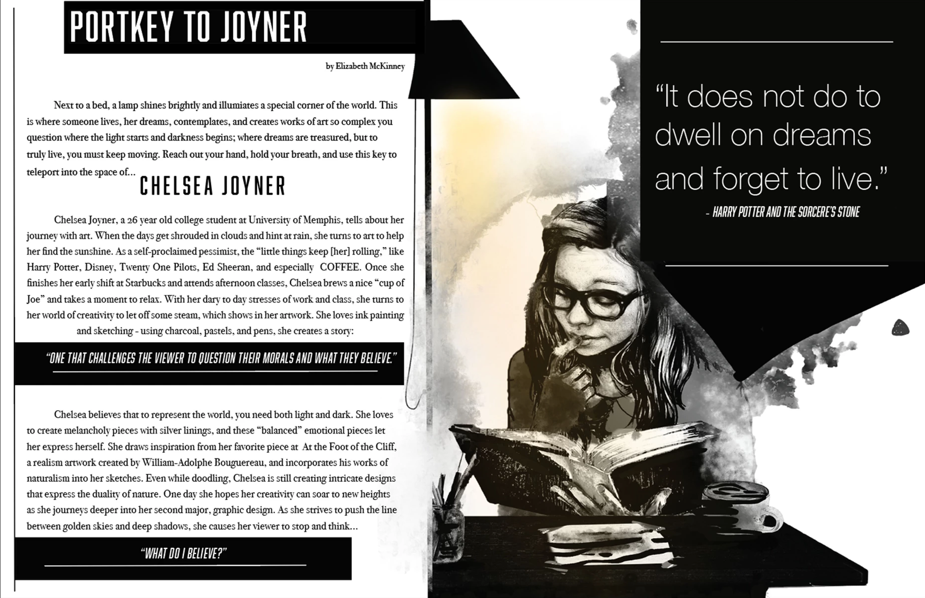
Project 4 - Magazine Spread: After interviewing my partner, I came up with a sketch that would mirror the data I had learned from her: my partner loved escaping from reality and diving into fantasy and creativity. To highlight this, I drew a portrait of her surrounded by art supplies and reading thoroughly over her desk, as well as a relaxing, hot cup of coffee ready-to-go. This illustration of her hobbies signifies inspiration and innovation.
The monochrome color scheme, with a hint of yellow from the lamp, and massive segmented blocks gives the overall image a modernistic style that’s organized. After studying articles and magazines, I decided to use the shortened “pull quotes” strategy on the segregated blocks - this gives it a visual interest that takes a break on a text-heavy page(s) and consists of few images or artworks.
The monochrome color scheme, with a hint of yellow from the lamp, and massive segmented blocks gives the overall image a modernistic style that’s organized. After studying articles and magazines, I decided to use the shortened “pull quotes” strategy on the segregated blocks - this gives it a visual interest that takes a break on a text-heavy page(s) and consists of few images or artworks.
Writing by Elizabeth McKinney.
Interviewee: Chelsea Joyner.
Portkey to Joyner
Next to a bed, a lamp shines brightly and illuminates a special corner of the world. This is where someone lives, her dreams, contemplates, and creates works of art so complex you question where the light starts and darkness begins; where dreams are treasured, but to truly live, you must keep moving. Reach out your hand, hold your breath, and use this key to teleport into the space of . . . Chelsea Joyner.
Chelsea Joyner, a 26 year old college student at University of Memphis, tells about her journey with art. When the days get shrouded in clouds and hint at rain, she turns to art to help her find the sunshine. As a self-proclaimed pessimist, the “little things keep [her] rolling,” like Harry Potter, Disney, Twenty One Pilots, Ed Sheeran, and especially COFFEE. Once she finishes her early shift at Starbucks and attends afternoon classes, Chelsea brews a nice “cup of Joe” and takes a moment to relax. With her day to day stresses of work and class, she turns to her world of creativity to let off some steam, which shows in her artwork. She loves ink painting and sketching - using charcoal, pastels, and pens, she creates her story: “one that challenges the viewer to question their morals and what they believe.”
Chelsea believes that to represent the world, you need both light and dark. She loves to create melancholy pieces with silver linings, and these “balanced” emotional pieces let her express herself. She draws inspiration from her favorite piece at At the Food of the Cliff, a realism artwork created by William-Adolphe Bouguereau, and incorporates his works of naturalism into her sketches. Even while doodling, Chelsea is still creating intricate designs that express the duality of nature. One day she hopes her creativity can soar to new heights as she journeys deeper into her second major, graphic design. As she strives to push the line between golden skies and deep shadows, she causes her viewer to stop and think “what do I believe?”
Fall 2018, 2223 Computer Assisted Graphic Design
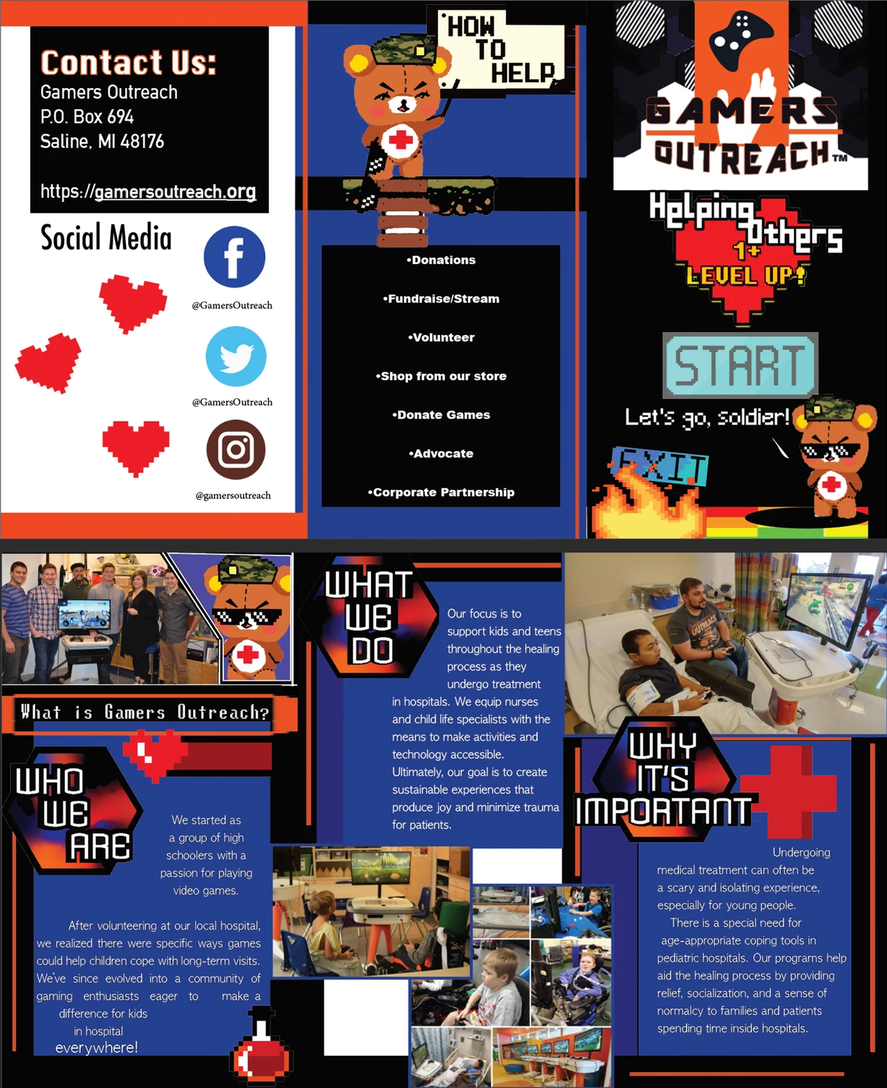
Project 5 - Non-Profit Brochure: Being assigned to design a tri-fold brochure for a non-profit organization, I chose the Gamers Outreach and created a minimized background similar to an arcade. While researching ways to make the brochure look fun and outgoing, I illustrated a soldier-like bear character that “orders” the viewer around. Combining the Gamers Outreach’s logo with hexagons and pixel art, I kept up a simple style of graphics to unite the images and information from their website.
Fall 2019, 2213 Typographic Design 1
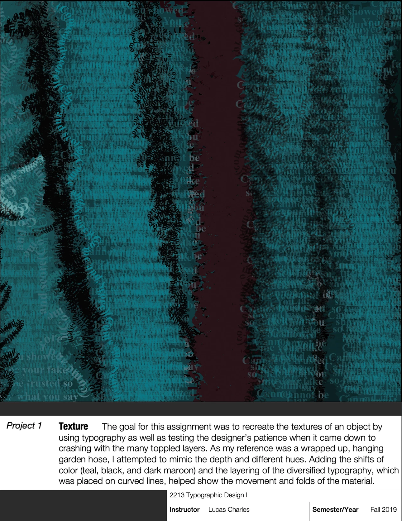
Project 1 - Texture: The goal for this assignment was to recreate the textures of an object by using typography as well as testing the designer’s patience when it came down to crashing with the many toppled layers. As my reference was a wrapped up, hanging garden hose, I attempted to mimic the depth and different hues. Adding the shifts of color (teal, black, and dark maroon) and the layering of the diversified typography, which was placed on curved lines, helped show the movement and folds of the material.
Fall 2019, 2213 Typographic Design 1
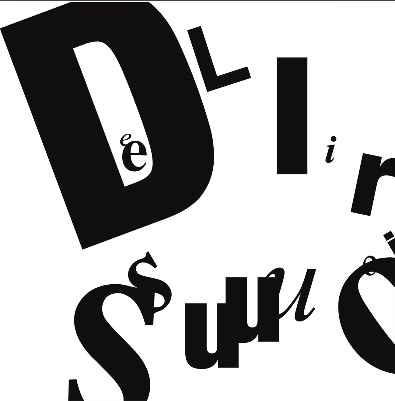
Project 2 - Denotation: To demonstrate the wildness of the adjective “delirious” using typography, I placed the distorted-like text on a white background to make the word “pop” when being placed on the black matboard. The letters are different fonts and sizes, turned to different angles, and some are cut off trying to escape the page which gives this a hysterical aspect. It sends out Alice in Wonderland vibes. The viewer will ask themselves, “Have I gone mad?”
Fall 2019, 2213 Typographic Design 1
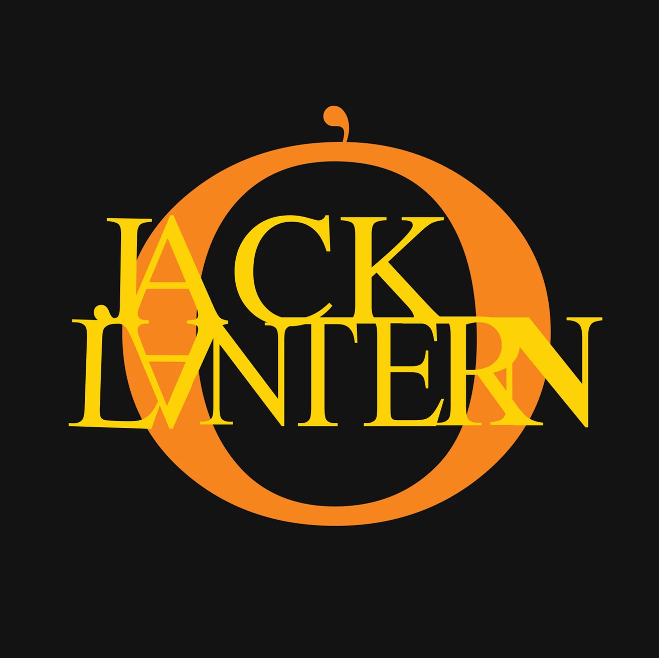
Project 3 - Connotation: Given the opportunity to use color and a bit of manipulation, we were to imitate objects literally with just text, similar to creating logos. Because spooky season had come around the same time as I was creating this work, I created a simple pumpkin out of the word jack-o’-lantern, using the “o” and apostrophe for the pumpkin and stem with the rest of the letters as the glowing candle light that radiates from the inside out.
Fall 2019, 2213 Typographic Design 1
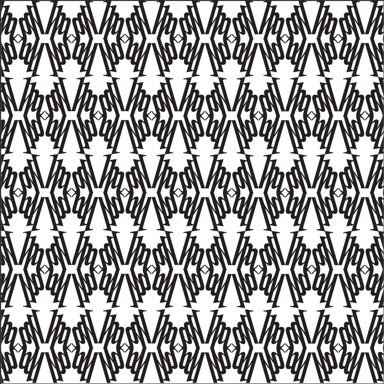
Project 4 - Pattern: For the pattern project, I decided to use an italicized lowercase “h” in Times New Roman. I used rotation and mirroring, making it similar to a stylized Victorian era wallpaper.
Fall 2019, 2213 Typographic Design 1
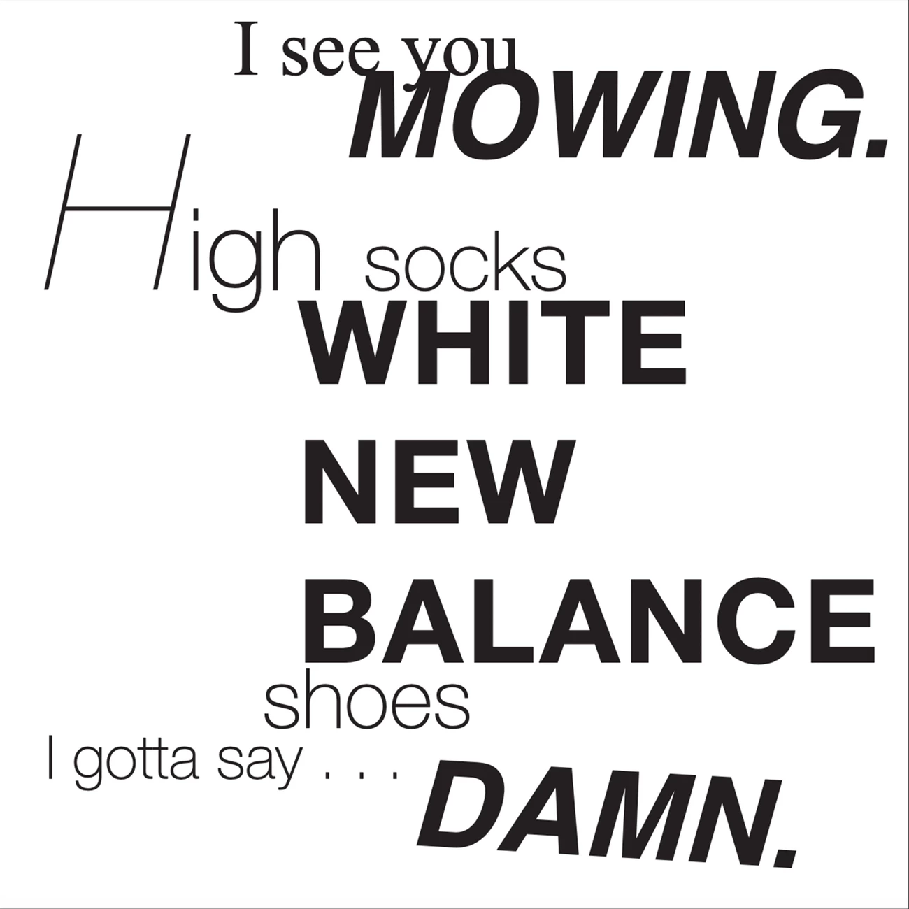
Project 5 - Intonation: This project needed to include a haiku that was arranged to produce varying intonation. I created a humorous haiku about the general “dad” trope with their obsessions of a well-manicured lawn, high socks, and white new balance shoes. The way I arranged the words of each line cause the reader’s voice to rise and fall in ways different than if they just read them in a straight line and highlight the important aspects of the dad figure.
Fall 2019, 2219 Visual Thinking
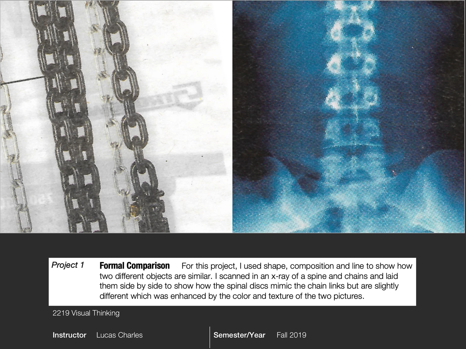
Project 1 - Formal Comparison: For this project, I used shape, composition and line to show how two different objects are similar. I scanned in an x-ray of a spine and chains and laid them side by side to show how the spinal discs mimic the chain links but are slightly different which was enhanced by the color and texture of the two pictures.
Fall 2019, 2219 Visual Thinking
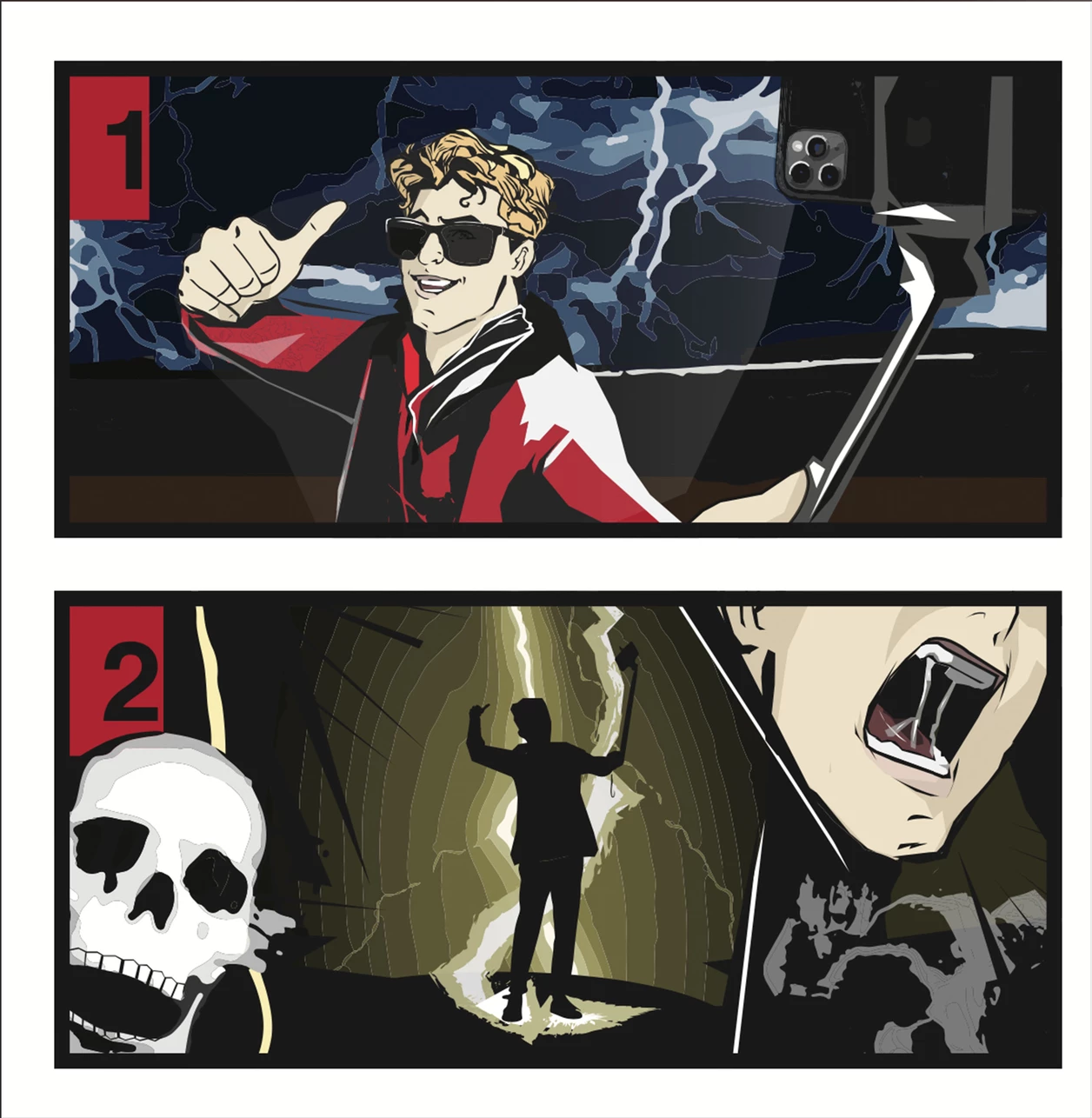
Project 2 - HOW TO: In two panels, we were to create an instructional visual without using words. Finding interest in storms and remembering Marv getting electrocuted in Home Alone 2, I decided to illustrate a witty tutorial on “How to Get Struck by Lightning.” The first panel shows a “cool” character holding up high a metal selfie-stick in the middle of a thunderstorm. The second panel demonstrates the character screaming, having known he made a ridiculous mistake far too late, struck by lightning. I made the background similar to a comic style, extremely vibrant with bold lines.
Fall 2019, 2219 Visual Thinking
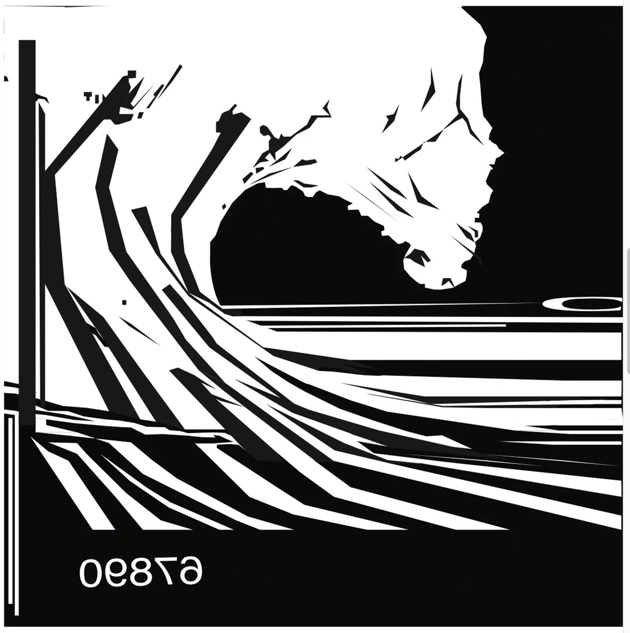
Project 3 - UPC: In my UPC project, I needed to take a barcode and create a picture. Barcodes and UPCs generally represent order and structure, so I chose to go in the opposite direction. The lines swirl together to create a crashing wave with all the random ferocity but beauty of mother nature, much different from our ordered society where things are prized if they are kept within the lines. The backwards numbers of the barcode further highlight the chaotic nature of the picture and show that sometimes our society has a backwards way of life compared to the world around us.
Fall 2019, 2219 Visual Thinking
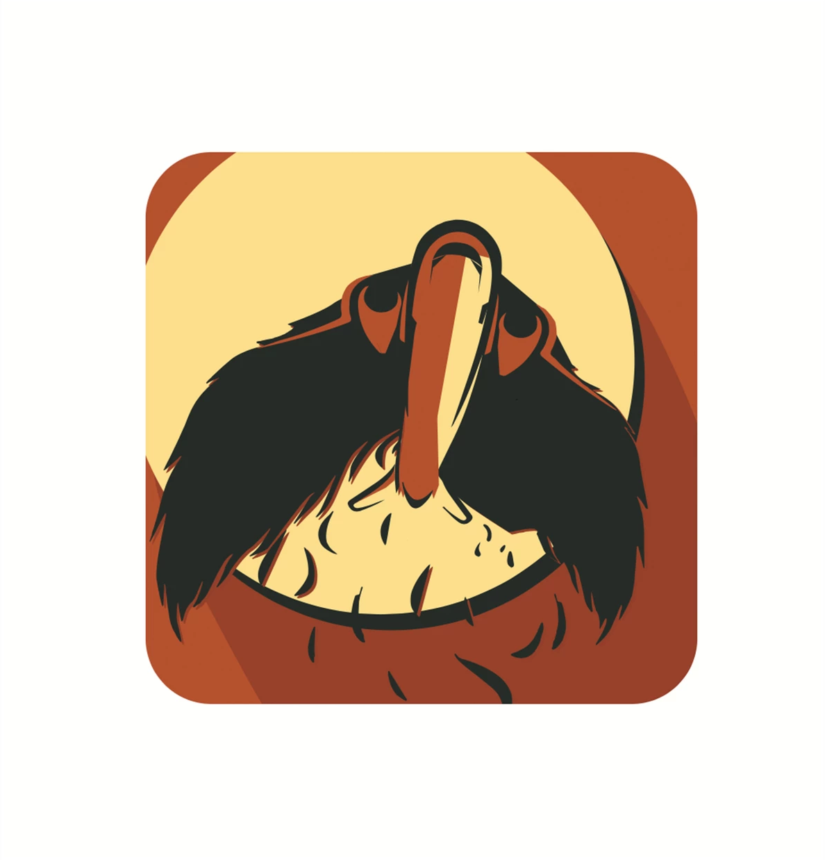
Project 4 - Icon: I was given an adjective and a noun to create an icon. I randomly drew “mythical” and “airplane” for my adjective and noun, and I immediately thought of Icarus. The boy with wax wings who ignored his father’s warnings, flew too close to the sun, and drowned. I wanted to bring the Icarus’ awe into the icon along with his father’s sorrow, so I designed the body of an airplane with the wax and feather wings of Icarus, flying high with its nose pointed up, soaring ever higher and reaching for the sun. There are several feathers falling from the plane’s wings, pointing to the imminent demise of the plane, along with the red sky that represents the sunset and the ending of a life.
Fall 2019, 2219 Visual Thinking
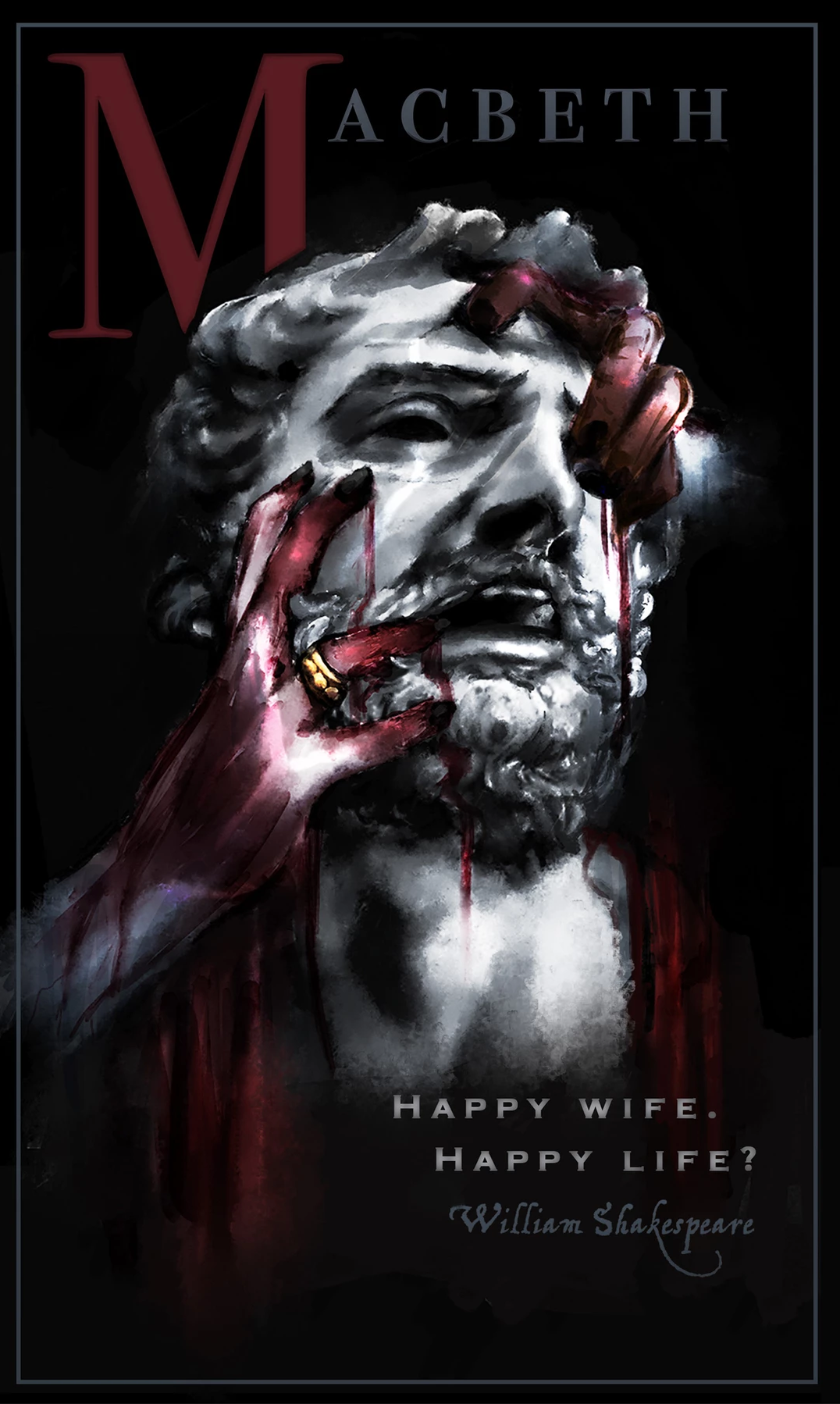
Project 5 - Metaphor: I was assigned to create a Shakespeare movie poster with a phrase that represented the story. I chose Macbeth and looked up references of Greek sculptures to draw Macbeth as a marble sculpture, representing his strength. I had my sister model, pulling at her face and drew her hands pulling at Macbeth’s face and added a ring to represent his wife’s hands pulling him into doom. Her hands are covered in blood as she did the first horrible deed and the sculpture looks as if he is in pain that he is being dragged under by these sin-stained hands. The quote I used was “Happy Wife. Happy Life?” as irony that in this marriage, his wife’s happiness led to his ruin. I used dark monochromatic colors in everything but the blood and ring to bring attention to his wife’s hands as well as the “M” of Macbeth that tied together with the blood.